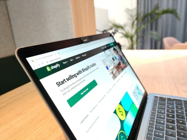
Shopify website design is important. Believe it or not, having a good Shopify website design is the biggest leader in sales conversion for this platform. Whether you want your customers to buy a product or service, your website is the determining factor for their decision. When customers visit your landing page, the sales process should be smooth and simple.
Here are 9 tips everyone should follow for amazing web design to maximize your Shopify sales.
1. White Space
You want to guide your audience toward buying your product or service. If your customers find that your website is too unorganized or confusing, they’ll end up leaving. That’s money out the door for you.
Let’s look at two examples of website design and see if you can spot the difference:
 Source: craiglist.org
And number two:

Source: https://wpstandard.com/
What’s the difference between these two websites?
If you’ve ever looked into website design, you might have heard the term “UI.” This stands for User Interface, which pretty much the screen layout your users interact with.
In these two examples, we can clearly see the difference in the user interface. Craigslist is a popular website for advertising but is made ineffective because the UI is cluttered. This is bad website design because users won’t know what they are interacting with due to volume. There isn’t a center stage for our audience to focus their attention on.
For WP Standard’s Shopify website design, we can clearly see that they are promoting their latest product, the Rucksack. There isn’t any other distraction on the page so users can focus on a product of their interest.
WP Standard has an ideal Shopify website design because they use what is called “White Space,” or also known as “Negative Space.” Negative space is empty parts of the screen that hold no content, and “Positive Space” is parts where content is present. Negative space is important because it emphasizes the product you are trying to capture your users’ attention. Any good web designer would know that we are looking for quality and not quantity.
Let’s look at a more obvious example of good UI with proper use of white space:
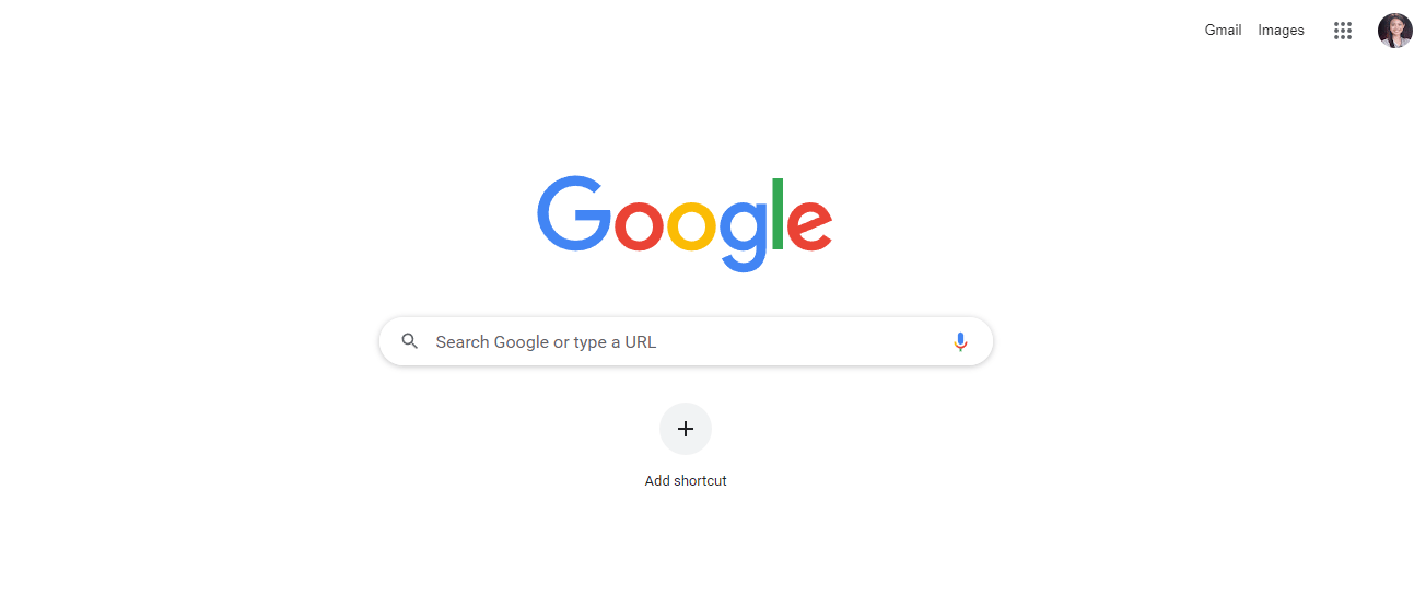
As we can see, Google’s landing page is extremely minimalistic. They implement a lot of white space so that their users can focus on one thing: their search engine function. The user’s eyes will move towards the only colored part of the page which helps streamline what Google is trying to get their users to do.
Having a good ratio of positive and negative space creates a proper form of visual hierarchy that funnels your user’s attention towards what you want them to focus on. If you want your customers to land on a buying page, then you want the link button to stand out most on your page. Without the proper use of negative spacing, your users won’t know what to do when they navigate on your website.
2. Fewer Options, More Sales
Have you ever gone to a restaurant where the menu had too many items?
Having too many options leads to indecisiveness. Too many options are overwhelming for your audience, and they won’t want to go through the hassle of navigating through everything available to them. Increased choices mean increased deciding times. When the sales process takes too long, people lose interest in the heat of the moment.
Similar to white spacing, you want to lower the amount of clutter on your page to streamline the sales process. Let’s look at another example of this:

Source: https://shop.m2sbikes.com/
M2S Bikes’ goal is to get its users to purchase their bikes. Again, we can see the use of positive versus negative spacing in this example. Pay closer attention to how they are lowering the number of interaction options for their customers so it is easier for them to make a purchase. The only component users will focus on is the “shop now” button.
If we dig deeper into the website, we get this:

Notice how M2S Bikes has very few options for its customers to look at. Although they have a wide variety of bikes, they utilize fewer options on their products page to help create emphasis on their bikes. This makes their products stand out more to their customers and spurs more interest. M2S Bikes has an incredible example of a good Shopify website design.
3. Rule of Thirds
The Rule of Thirds is a good website design technique that most designers use when creating an aesthetic web page. In essence, it is a 3-by-3 grid that helps determine where your users will be looking at. We can reference the grid to help focus our audiences’ attention to what we are trying to get them to do on our website.
Research has shown that upon visiting a website, users will focus on the outer corners of your website more than anything. We can play off of this by using the rule of thirds to help us format our website.

Source: https://tympanus.net
Knowing where our user’s focus is, we want to place components of our website where they will be looking. Most websites already do this by using the rule of thirds, and you should be too. Let’s look at Shopify’s website:
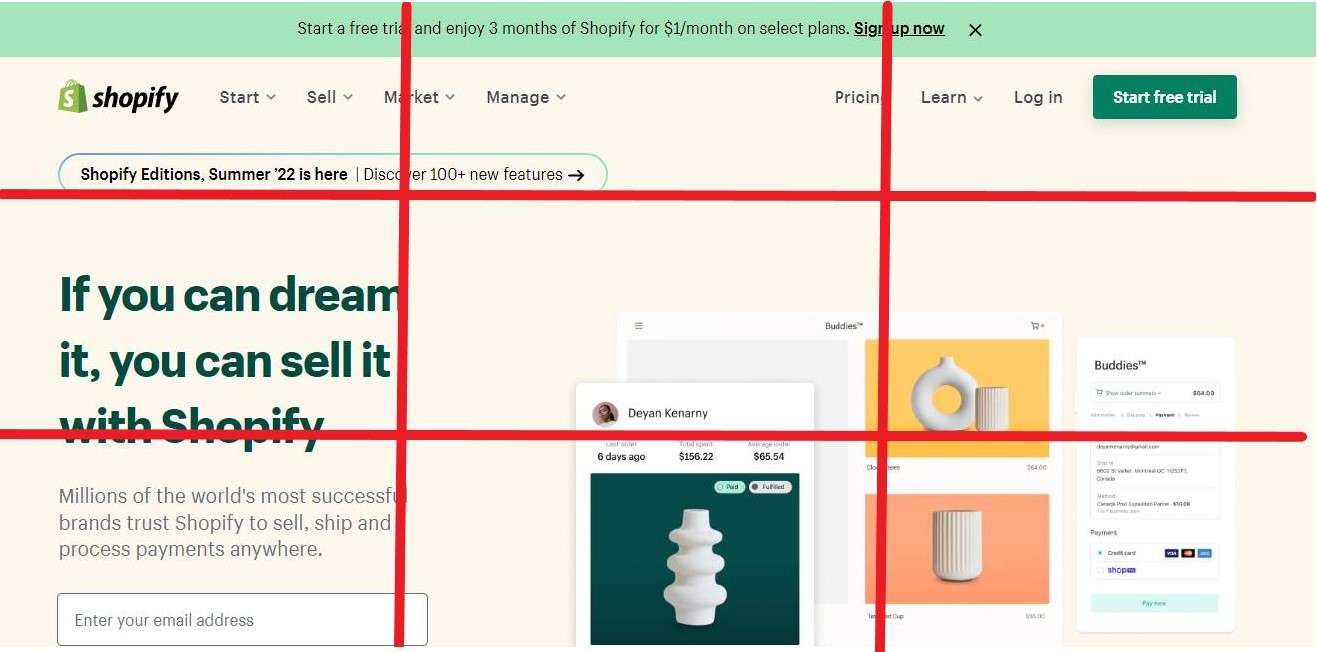
Source: https://www.shopify.com/
We can see how Shopify follows the rule of thirds by placing their email signing list in the 41% segments. Next, pay attention to the upper right segment where the buttons “Start Free Trial” is located along with a video. These are interaction points that Shopify wants its users to explore. The bottom corners then have images because they are less interactive, which makes sense because users don’t focus on these spots as much as they do on the top corner segments.
The lesson we can take from the Rule of Thirds is we want to place our actionable items that our users will be paying attention to. Typically, we see that our users pay a majority of their attention to the left-hand side of the screen. This is the target spot we want to place the interactive components of our website to boost conversion rates.
Let’s look at another example where we use the Rule of Thirds differently, but still following the rules.

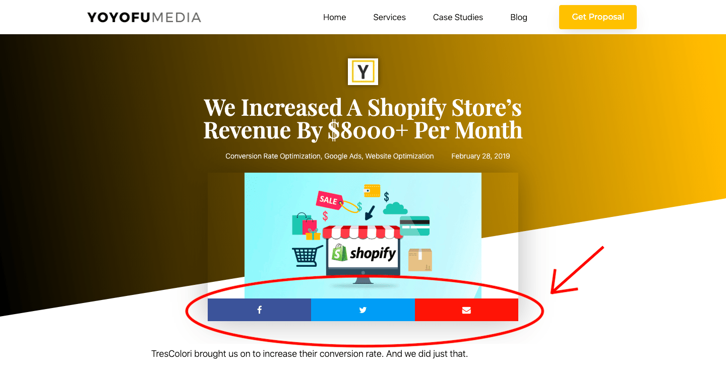
Source: https://yoyofumedia.com/
In our example, we placed our logo on the top left so our users can navigate to our home screen. On the top right, we have our navigation bar to make website exploration simple.
What’s different about our website design is we placed our “Book Your Strategy Call” button in the bottom segment of the grid. Now, you may be thinking this strategy breaks the rules of the Rule of Thirds, but it doesn’t. And here’s why.
Our only action item in the entire bottom two rows of the grid is the “Book Your Strategy Call” button. Out of all the 6 different segments of attention blocks, there is only one interaction point between our website and our users. In essence, this strategy is viable because it helps funnel our users divided attention into one action: booking a call.
When using the Rule of Thirds, it’s important to keep in mind that we are trying to divert out users’ attention toward the end goal. We place website components that take up more grid boxes to help emphasize what our audience should be paying attention to. This will help streamline the web journey of your users and guide them in the right direction when navigating your website.
4. Visual Rhythm
Visual rhythm is simply spacing your website using repeating elements that help create structure and reliable patterns for content.
Creating visual rhythm is important to sharpen your website and make it look more reliable. If things seem out of order, your users will think your business is too.
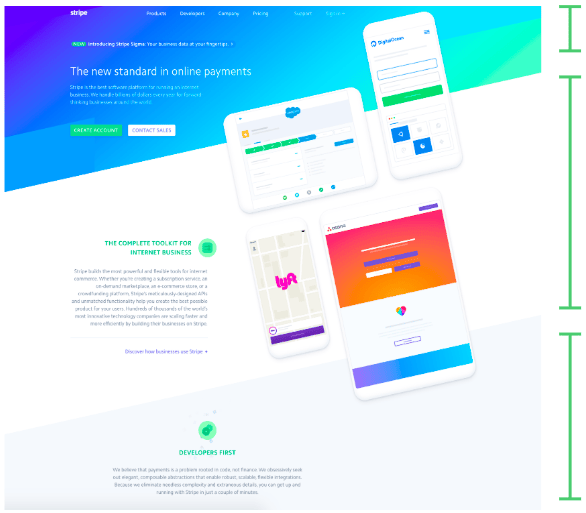
Source: https://stripe.com/
Adding excitement to your website is one of the key elements of a good Shopify website design. If your website is engaging, your visitors will be engaged in what your website has to offer too. Creating visual rhythm is one of the best ways to take control of user engagement and help shift them towards conversion.
5. Color Scheme/Themes
Take a look at the color scheme of this website and think about what emotions you get out of it:
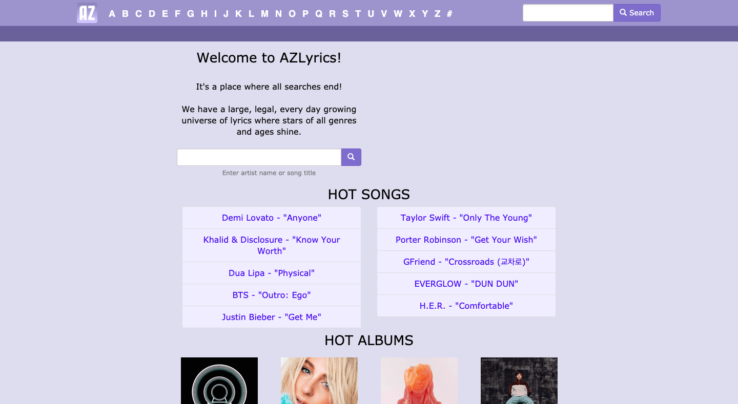
Source: https://www.azlyrics.com/
Seems boring, right?
This is an example of a bad color scheme. AZLyrics is a popular website for its audience to look up song lyrics, but the website design is terrible. The colors invoke feelings of boredom, somberness, and disinterest. None of the colors stand out and users feel tired from using the website.
Now, take a look at Beardbrand and think about the color scheme:
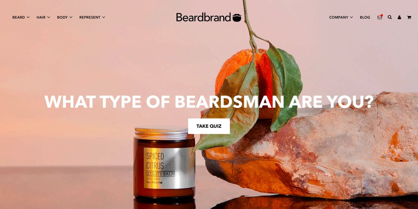
Source: https://www.beardbrand.com/
Much better. Good Shopify website design starts with taking advantage of color and emotions. The colors on this website invoke feelings of attraction, earthiness, and excitement. Beardbrand uses a color scheme that relates to its users because it is a grooming focused product that emphasizes self-care and personal image. Targetted towards men, the brand wants to show its users that by using Beardbrand’s product they will feel more charming, elegant, and confident.
Color schemes are important for portraying your brand, and each color is psychologically connected to specific emotions. By connecting colors to brand relatability, you can help your audience build trust and excitement about your company.
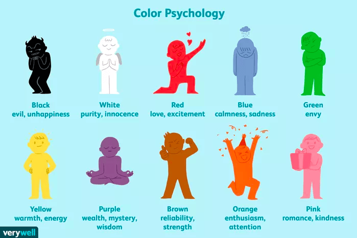
Source: https://www.verywellmind.com/color-psychology-2795824
6. Search Engine Optimization (SEO)
According to a study by the Aberdeen Group on website design, a mere one-second delay in page load time results in a 7% reduction in conversions.
SEO is important for Shopify website design because it helps increase website traffic, engagement, and conversions. If your page doesn’t appear as a top search, that automatically communicates with your audience that your website isn’t credible or of quality.
There are one but many ways to build trustworthiness through SEO, a few methods include:
- Quality Backlinking Profiles
- Positive User Experiences
- Optimized on-page elements and content
- Machine learning signals
Credibility isn’t something that can be built overnight. It’s a long-term investment that starts with SEO and ends with more sales. It requires patience and effort to establish trust with your users but also relies on providing valuable products or services that allow customers to trust your brand.
7. Conversion Rate Optimization (CRO)
How might we enable our website visitors to take action on our website?
When looking at a brand, people desire fulfillment. They want a product that speaks to them and a buying process that makes the experience memorable.
In order to do this, we need to adjust our Shopify website design so that customers are excited to explore your Shopify store. Here are a few things to look out for when conducting CRO:
Homepage
The first thing that your users will see is your homepage. Your homepage is the guiding light of your website – it is what makes the first impression and your chance to enable your website visitors to dive deeper into your website. To make your website more appealing at first glance, we can incorporate things like inspiring quotes, quality images, and product information.
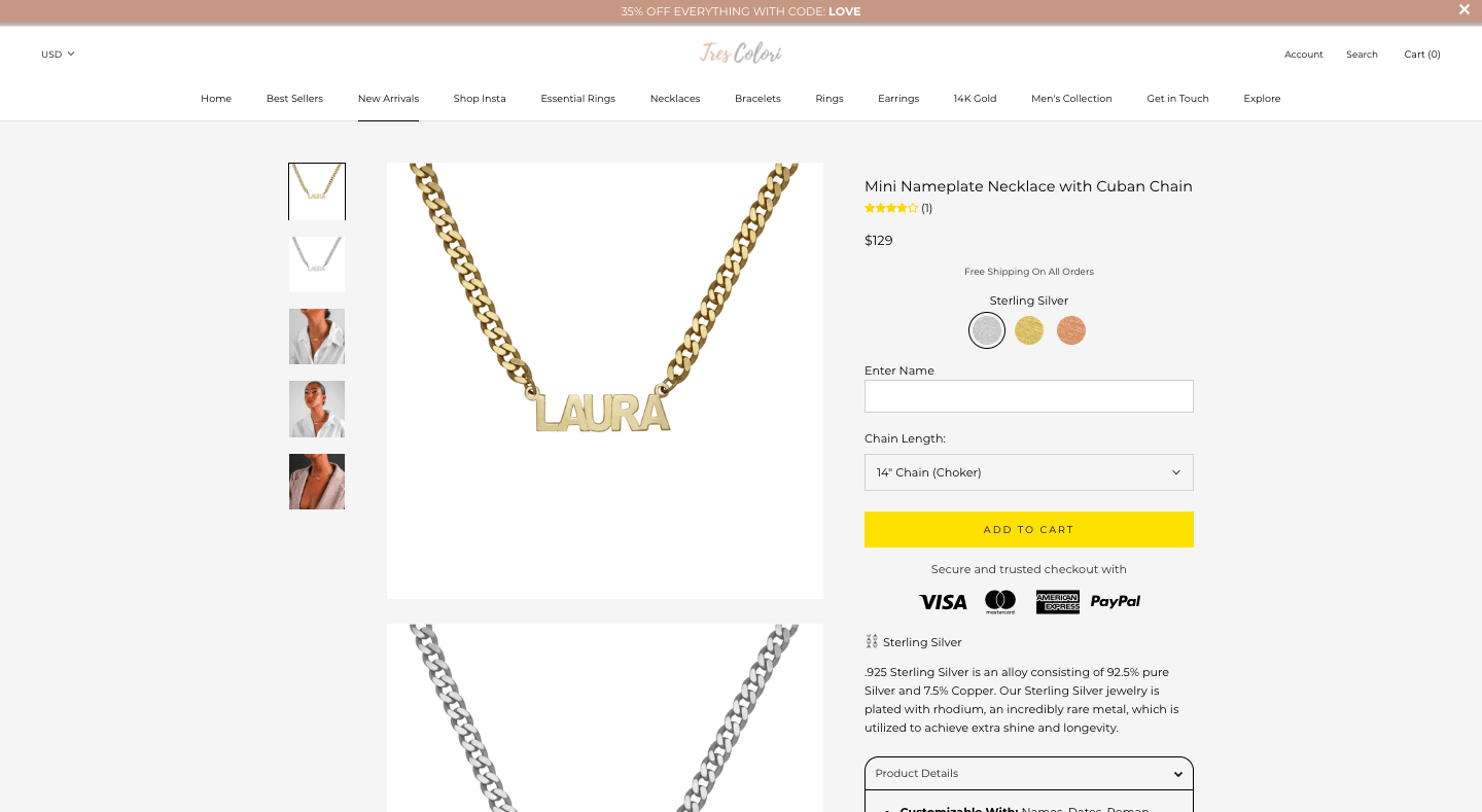
Here’s a case study of some CRO strategies our team at YoYoFuMedia did for TresColori:
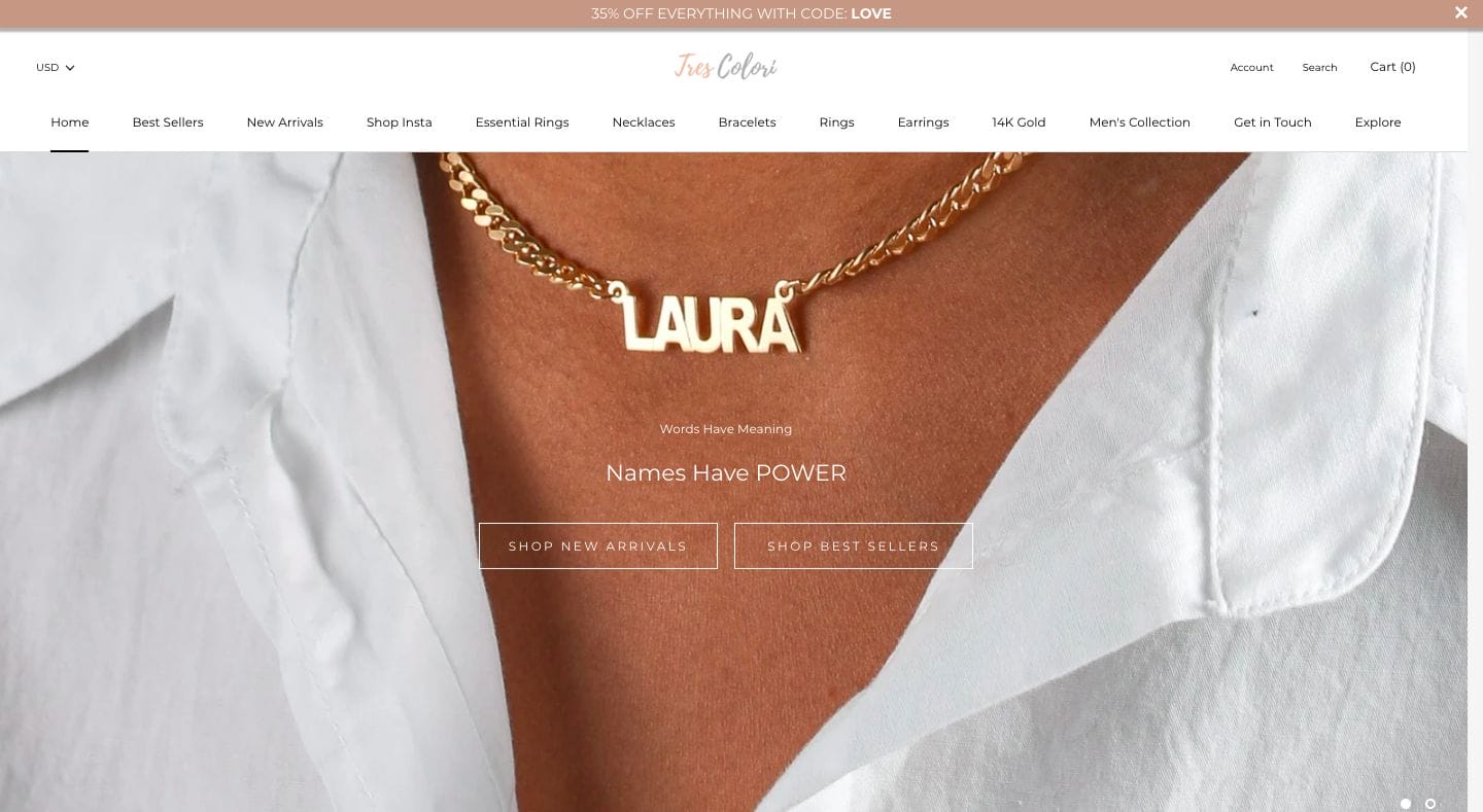
Let’s break down the website design of this page.
As soon as people visit TresColori’s homepage, they immediately see a close-up example of their product. At this point, their visitors could imagine a necklace with their name on it and feel connected because “Laura” is a name they can probably relate to.
Next, TresColori has two select buttons allowing users to “Shop New Arrivals” or “Shop Best Sellers.” This comes in addition to their well-organized navigation bar on top, enabling users to flow effortlessly throughout their website.
Lastly, what entices their visitors is the high-quality image of the product and the model wearing it. Adding a human touch is what makes the product relatable – people want to see what TresColori’s jewelry looks like when tried on. This adds a human touch that helps people feel connected to the product.
Price Page
Let’s look at TresColori’s pricing page.:

The price page could either make or break a person and their decision to buy. What TresColori does right with their Shopify website design is by portraying their price underneath their product ratings and giving a detailed product description. This helps customers know exactly what they would be buying.
Product ratings are important because people are social animals – meaning they believe what other people are saying about products. In this case, placing the product rating before the price helps people understand that they would be purchasing a quality item they can trust.
Blog Posts
Creating a blog is one of the easiest ways to build customer trust, which in turn leads to CRO.
Blogs are a massive opportunity for Shopify businesses to convert readers into leads, and then leads into sales. By writing blogs, not only does it show that your company does its research and knows its industry, but it also shows your website visitors that your company values its customers by providing them with thoughtful information.
There are many ways you can do CRO through your blog to elevate your Shopify website design. A few of the methods include adding a call-to-action throughout your post, adding an email signup list, or in some cases a phone number for free consultations. You want to guide your readers to learn more and get them interested. You could even offer them a free eBook or discounts in exchange for their emailing address.
Landing Page
Having an amazing landing page is CRUCIAL for CRO. Landing pages are optimized specifically so your customers take action, and you want to guide them through that process as seamlessly as possible.
Here’s what TresColori’s landing page looks like:
What makes TresColori’s landing page so appealing?
Immediately, we can see that TresColori provides alluring images. Not only do they provide images of their product, but we can see that there are options to view them on models. They’re also very discreet with what they are selling. It’s clean-cut and straight to the point.
At YoYoFuMedia, we took TresColori’s website and conducted CRO tactics on web design that increased their monthly revenue by over $8000 per month. We showed users what we did to get the best results when for our strategies.
CRO is a concept that falls hand-in-hand with a good Shopify website design. When doing both correctly, you’re on track for having a powerful website that attracts many sales.
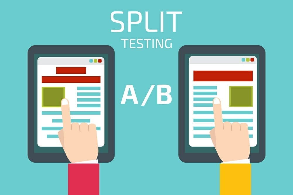
8. A/B Testing
How do we find out what website layout works and what doesn’t?
Obviously, we can’t know until we test it. That’s why there’s something called A/B Testing.
A/B Testing, otherwise known as Split Testing, is where we have two variants of a page and show it to users at random. We then look at which page statistically performs better with conversion.
A/B Testing isn’t something that can be done overnight – it as an investment for the long run. Companies are constantly running split testing experiments in search of the best layout for conversion, and you should be too if you want to grow your eCommerce store. It helps you craft the best Shopify website design based directly on what your users are saying.
9. Mobile Friendliness
“Mobile eCommerce sales account for 34.5% of total eCommerce sales in 2017, and that number is growing. By 2021, mobile eCommerce sales are expected to account for 54% of total eCommerce sales.”
Source: https://www.bigcommerce.com/blog/mobile-commerce/#why-does-mobile-commerce-matter
With such a high number of eCommerce sales being mobile, it’s easy to say mobile optimization is important. In fact, 95% of mobile internet users look up local information on their phones for the purpose of calling or visiting a business.
Luckily, when designing your website for mobile, there are tools to help indicate what aspects need improving. One of the most popular tools is Google Mobile-Friendly Test. Here’s how it works:

One of the coolest features is that Google Mobile-Friendly renders what your website would look like on mobile. On the left, it shows you whether it is mobile-friendly or not, and what to fix if it isn’t. Let’s look at what that looks like:
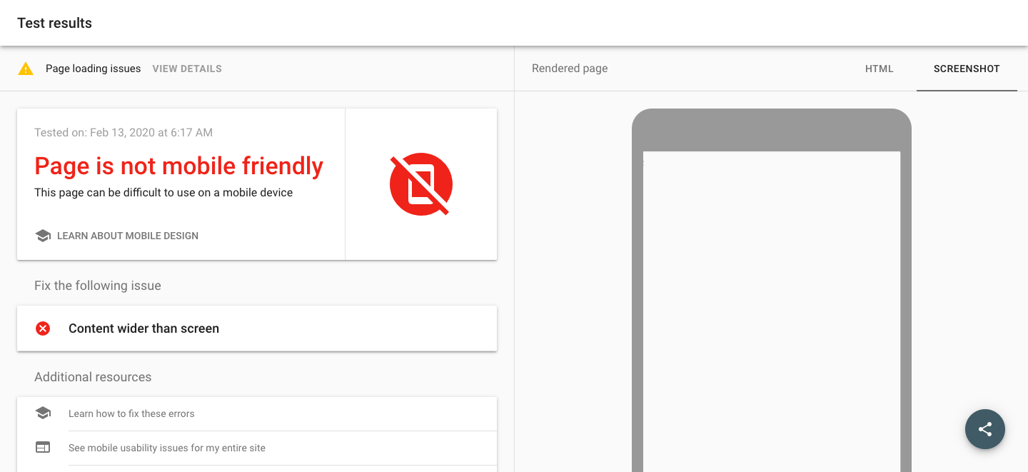
As we can see, the example Google Mobile-Friendly test indicates that what doesn’t work on the website. One of the possible issues could be that the content is wider than the screen, which is a common coding issue that many developers have to avoid. Using Google’s mobile-friendly feature can help indicate what isn’t working with your Shopify website design. From there, you can work on fixing that issue.
Bonus Tip: Social Media
Here’s another bonus tip to help optimize your website: You want to remain in contact with your visitors as often as you can, so it’s important to let them know where else they can find your content. One of the best ways to do so is by linking your social media.
By linking your social media (i.e. Instagram, Facebook, Twitter, etc.) you have a direct channel to update your customers with the changes that are happening in your store. If you introduce a new product, you can let customers know immediately through posting on social media.
There are lots of benefits in doing this – you have lots of room to leverage sales with things like promotions, exclusive products, contests, partnerships … the list goes on. Many companies are already doing this with their eCommerce stores. However, what most eCommerce stores fail to do is maintain their channels and keep up a unique personality on social media.
It’s as easy as inserting a button on your website and linking them to your social media. It’s nice because it adds color and excitement to your Shopify website design. Doing this is another form of call-to-action to increase your marketing and trustworthiness as a brand.
Recap: How to Improve Your Own Shopify Website Design
Now, we’ve gone through quite a bit of material so let’s summarize everything we talked about.
- White Space
- Fewer Options, More Sales
- Rule of Thirds
- Visual Rhythm
- Color Scheme/Themes
- Search Engine Optimization (SEO)
- Conversion Rate Optimization (CRO)
- A/B Testing
- Mobile Friendliness
Good Shopify website design is what differentiates a successful Shopify business from a bad one. Oftentimes, Shopify businesses tend to forget that the face of their company starts with their website in the growing digital world. Maintaining your website and public image is the first step to growing your Shopify business.
If you follow these tips, you’re sure to have a beautiful website that will lead you to more sales and a better brand image. Remember to always do your own research and get creative!
Did we miss anything? If so, leave a comment down below!


2 thoughts on “9 Tips to Increase Sales with a Better Shopify Website Design”
You need to take part in a contest for one of the best blogs on the web.
I will recommend this blog!