
We are currently living in a breakneck society. A digital world where people use smartphones for speedy information. This is why your practice should have the best ortho website design to stand out from a sea of other orthodontist websites.
It is also important to note that people spend more time on their phones than on desktop computers. This is why a visually stimulating orthodontic site will help you gain potential patients. It is also key in maintaining existing patients at the same time. Stay relevant and build a strong online presence. All by communicating and conveying helpful information.
Orthodontist Website
Orthodontists and other medical providers should keep a modern and updated website. It is paramount for a strong business. According to research around 74% of adults in the United States use the Internet. 61% of these people look for health or medical information online.
The Best Orthodontic Website design will provide patients and new visitors with a powerfully executed visual presentation. They present an effective layout that provides fast site navigation. It is mobile and user-friendly too. This enables visitors to identify pertinent information quickly.
Do you want a bad-ass website?
Consider using Facebook Ads for Orthodontists to bring more potential patients to your website.
Orthodontist Website Design – Characteristics Of A Great Website
Your website has the potential to be the first interaction that future patients have with your practice – and you want it to be a good one. What are the characteristics of a great website?
Make sure that potential patients feel comfortable with getting their teeth done at your orthodontics practice. To do this, you should be sure to have a web design that will wow anyone.
You have a way to increase your audience while avoiding losing patients. All you need to do is take the time to create a web design that promotes your practice. The secret is a clean and professional look. Here are some of the things to consider to end up with the best ortho website design.
1. Color Psychology – How to pick the right color and font
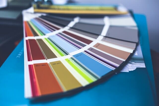
Applying color psychology in creating your website can influence how your potential patients feel. Color psychology studies how specific colors affect human behavior. Each color has a different meaning and invokes a certain message. Colors have psychological effects that vary across different cultures.
Color psychology is largely impacted by culture, age, gender, and personal preference. When it comes to website design, color and font are two of the key elements.
For example, if you specialize in orthodontics for kids, consider using a palette with bright shades and pastel colors instead of dark shades for your orthodontic Websites design. Also, consider fun fonts instead of the more serious ones.
If you are aiming for a strictly professional website, you should choose colors that are simple and appropriate for all age groups. Give your target audience a custom orthodontic website design with a font that is professional and easy to read. You can’t expect the 30 and 40-something people to scroll through your About Me page in Comic Sans.
2. Great Website Navigation for the Best Orthodontic Website design
Navigation is an element in website design that can make or break your orthodontist’s website performance. Without uncomplicated navigation, users won’t be able to easily find what they need.
If your site is too confusing, your potential patient might end up navigating —far far away from your site.
You should create a navigation bar that presents the main pages of your site. Use easy-to-understand tabs that users will understand. For example, you should have an About Us tab, another for a Contact Us with your location, and another for contacting you. It also helps to have a Services tab so people will know your specialties and other services you offer.
Some people also have a tab for the staff and team so potential patients can know your orthodontists more. You can also include a tab for payment options and what to expect when they visit your practice. Each tab on your navigation bar can be broken down into more detailed tabs that give a clearer view of your website.

You can see from this example, that your different tabs should break out into a more detailed menu to be one of the best ortho website designs. See how the Services tab outlines all of the services this orthodontist offers.
3. Videos, Images, and other engaging elements
Remember to not be boring. In this digital age, you should include more than just text if you want users to feel comfortable on your website. It is going to be a great help to include elements that site visitors can engage with, such as:
- Images
- Videos
- Graphics
Images
You could share images of your office and photos of the different orthodontists in the clinic. Show off your staff too and give your practice more personality to create the best ortho website design out there. It’s also a good idea to post “before and after” photos of your patients. Just make sure you ask their permission first.
Videos
Some websites share a video walk-through of their office. This helps potential clients feel more at ease with getting their smiles done. This is especially important among younger patients and if they are visiting an orthodontist for the first time.
You can also share animated videos to show how a procedure works. Knowing what’s going to happen is definitely more calming than getting into something you have zero clue about.
Graphics
Publish infographics to your website and provide a fun way to learn about your services. Having graphics is another element that is extremely beneficial to include on your website. This boosts engagement and keeps users on the page.
Who would want to stay on a page with just huge blocks of texts right?
You could create an infographic that depicts a flow chart of your process from booking, assessment, payment, procedure, and follow-ups.
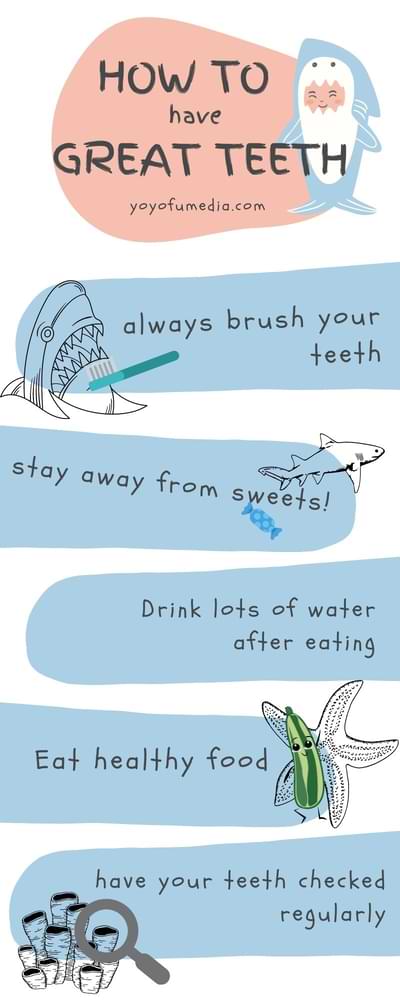
You can also show illustrations of how braces work to straighten your teeth and educate your potential patients more and probably give them the extra push to click “Book Now.”
4. Page speed and user experience
One of the most important parts of web design is your website speed. In simpler terms, we are talking about how fast your website loads when someone visits it.
If your site takes more than three seconds to load, there’s a chance that visitors will leave your site and go somewhere else where it doesn’t feel like forever before they see the company logo. This is what they call bounce. Yup, bounce like a ball. One second they’re there, gone the next.
We started this blog by talking about speed information. In our technologically advanced world, everyone wants the answers to their questions within seconds. This is exactly why if your pages load slowly, they’ll just go to another site to find the answers faster.
In fact, site speed is one of the ways that Google goes about ranking your website in search results. The ranking is based on user experience and page speed. Google wants to present the best possible results and experience to all of its users.
5. Adding a CTA Button
Another important part of web design is the call to action. This is also called CTA. CTAs are the buttons or forms that make site visitors take action. After all, everything you do should have an end goal in mind whether it is a call, a booking, or an engagement.

For example, after your infographic about how to care for new braces, you could put a CTA button underneath that potential patients could click to find out more about the teeth-straightening services you offer.

Providing contact forms at different locations on your orthodontics website also allows users to provide contact information. This gives you the opportunity to get in touch with them in the future and add them to your mailing list.

Best Ortho Web Design Programs
Choosing the best ortho web design software is crucial. This is if you want to build a successful website that engages your audience.
Some web design programs can help you build an intuitive interface without any code. You can even directly upload your site online. The best web design software can help you meet the goals of your orthodontic website.
1. Wix
Wix is probably one of the best website builders for small businesses. At $8.50 per month, Wix can help you design your website with eye-catching templates. It also has web design tools that are easy to use by beginners like you to create your best ortho website design.
This cloud-based web development platform has a simple drag-and-drop editor. It lets you create stunning custom orthodontic websites without any coding. You can use whatever template from over 500 options and effects like video backgrounds, animations, and scroll effects.
Finding a suitable template for your site won’t be too much of a challenge. You can narrow down your search and choose from different industry types like Tech, Beauty & Hair, Health, and more.
During the set up all you need to do is answer a few business-related questions. Wix will then give you a tailor-fit website that you can improve with over 30 built-in media galleries. You can design your site with elements just the way you want it. You can have a blog to share ideas and grow your community and even a Logo Maker to design a professional logo for your site.
For more details on orthodontist blog ideas, read our guide.
2. Adobe Dreamweaver
Adobe Dreamweaver lets you code your website design directly. Don’t get too scared though because you don’t have to be an expert in programming.
Adobe Dreamweaver is a mix of visual editing and HTML editing. When you code your own website with it you would have to put in more effort than when you use ready-made templates. The bright side is that you get the exact look you have in your head, rather than trying to work around another person’s design.
Dreamweaver allows you to come up with a responsive design. You can optimize orthodontic sites to display on both desktop and mobile devices, without limiting the user experience.
If you’re an advanced user, you will likely prefer how Dreamweaver provides multi-monitor support for Windows and supports the Chromium Embedded Framework (CEF). Create the best ortho website design with Git which lets you edit source code within Dreamweaver.
3. WordPress
WordPress is quite user-friendly where you can use its existing design templates for your website. Different from Dreamweaver and Wix, WordPress is a content management system (CMS) where setting up a website can take just minutes.
WordPress is easy to install. If you want to work with your own design, you can easily use the drag-and-drop functions you can download with a built-in framework. If you are far from being an advanced user, you can still create a professional-looking website without having to learn any coding or programming.
WordPress also has all these free add-ons available for you to download and install, often requiring nothing more than a few clicks. This makes the entire process of customizing your website a walk in the park. In general, WordPress is a very easy CMS to use which is a quick way to get your website online.
Do you want to get a super engaging website online fast?
Best Orthodontist Websites of 2026
Now that we’ve talked about the elements of orthodontist website design and the best ortho web design programs, let’s check out actual orthodontic websites. Take some notes on how the top orthodontic website designs were created.
1. Wade Williams Orthodontics
It is notable how Wade Williams Orthodontics was able to provide fast one-click access to booking an appointment. They also made it easy to visit their social media sites and even placed an informative YouTube video.
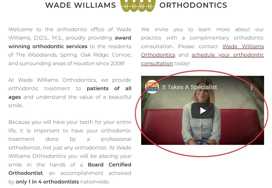
What they did right:
- Eye-catching landing page with large overhead photograph
- Lots of clickable links about their practice
- Enough content to keep visitors interested
- Optimized for desktop and mobile
2. Newpark Orthodontics
The Newpark Orthodontics website applies branding across all aspects of the company. This makes a positive impact on their visitors. They give you a refreshing site that grabs anyone’s interest.
What they did right:
- Crisp pictures
- Virtual office tour
- Used bright colors well by matching it with white space
- Provided a clickable link to their Facebook page
- Also allows visitors to visit social media pages easily
3. Two Front
Perhaps the best feature of the Two Front ortho website is that you don’t have to scroll down the page to learn important information.
What they did right:
- Provided straight-forward information
- Simple and crisp design
- Responsive even on mobile
4. Mill Creek Orthodontics

Mill Creek Orthodontics presents a website with a simple design. They combined this with the right content strategy that makes the website more effective.
What they did right:
- Highlights what makes them unique
- Keeping the spotlight on their patients
- Uses strong CTAs
- Site layout funnels patients to the right information (new patient/ returning patient)
5. Westlake Family Orthodontics
Westlake Family Orthodontics has a mobile-friendly site. One of the best things about it is perhaps the customer reviews and social media links.
What they did right:
- Social media links
- Quick and efficient access to information
- Photos and layout are modern and crisp
- Provided customer reviews
- Home page has easy access to pertinent information
6. Maryland Orthodontics
Maryland Orthodontics website shows how simplicity can make a big difference. Unlike most websites where you have to scroll and scroll….and scroll, this website is really short but is packed with information.
What they did right:
- Simple straightforward design
- Uses a minimalist approach
- Photos are fun and engaging
- Easy to navigate website
- Homepage is short but informative
7. Floyd Family Orthodontics
The Floyd Family Orthodontics is very welcoming to visitors. This is perfect, especially for those who are feeling a bit anxious to go through with the procedure.
What they did right:
- Welcoming and friendly
- Features their office dog making fun and friendly header video
- Shows happy and contented patients
- Virtual office tour
- Offers free virtual consultations
- Effectively answers common patients inquiries
8. Trü Orthodontics
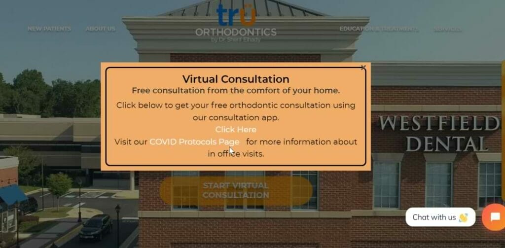
The Trü Orthodontics website shows off a fun website with bright colors and an intuitive layout.
What they did right:
- Informative pop-up
- Website gives off a fun, happy vibe.
- Modern but friendly design with bright colors
- Lots of movement on the website
- Offers lots of patient educational resources
- Easy to schedule an appointment
9. West Side Orthodontics
One of the things that West Side Orthodontics did right is providing a clean, well-organized website design.
What they did right:
- Crisp, uncomplicated website design
- Helps patients understand the process with the Your First Visit section
- Builds trust with good SEO through a map and directions
- Logos highlight their doctors’ education, certifications, and associations
10. Appel Orthodontics
Clearly investing a lot of time and energy in brand building, Appel Orthodontics shows off a unique logo with professional brand videos.
What they did right:
- Unique logo
- Professional brand videos
- Offers online messaging and free virtual consults
- Provides uncomplicated explanation about their services
- Gives out important information like insurance information, and about the procedure.
11. Caswell Orthodontics
Featuring a one-of-a-kind location-appropriate design, Caswell Orthodontics is able to perfectly balance SEO optimization and staying true to their brand.
- Unique location-appropriate design
- Offers free virtual and in-person consults
- Offers patient rewards program,
- Offers numerous ways for patients to get in touch
- Explains their services using fun interactive designs
- Shows potential patient reviews from satisfied patients
12. Dunn Orthodontics

You can see that Dunn Orthodontics has a bright and modern design. Having a design like this makes a website stand out immediately. Its design is unique and fun but remains professional where they used their very own images and videos.
What they did right:
- Compelling CTAs
- Offer free consultations
- Answers patient questions (payment details and financing options)
- Their before-and-after images paired with patient testimonials develops trust with potential patients
13. Happy Braces
Showing off a spacious overhead photograph layout, Happy Braces has a strategic content layout and is user-friendly.
What they did right:
- Spacious overhead photograph layout
- strategically placed side bars for easy access to valuable information
- Responsive for mobile and desktop users
- Easy to navigate and visually appealing
- Bright and inviting color scheme
14. Braces For Us
Most websites make the mistake of being too overwhelming. Braces For Us, on the other hand, doesn’t stuff you with too much content. The content is broken up properly for the site visitor.
What they did right:
- Provides just enough content
- Layout is user-friendly enough to comfortably navigate
- Provides quick valuable answers and information
- Mobile friendly
- Uses colorful photos that complement the site
15. Dr. Robert J. Herman
Dr. Robert J. Herman gives you a crisp and professional website that is clutter-free. They offer a plethora of information on the home page, which includes an office tour and information about their orthodontist.
What they did right:
- Offers a wide array of information on the home page
- Offers a virtual office tour
- Avoids flashy colors and graphics
- Responsive and uncomplicated newsletter section
- Menu is easy to navigate
16. Massih Orthodontics

Offering a fresh layout, Massih Orthodontics makes it easy for site visitors to navigate around it. The website uses welcoming textile backdrops.
What they did right:
- Teal and black color scheme is cool to the eyes.
- Mobile and user friendly
- Simple and clean home page
- Branding and logo is clever and cute
17. Ballard Orthodontics
Ballard Orthodontics shows us the benefit of focusing on patient problems and outlining solutions in simple, easy language. This is shown in a very helpful header video and original professional photos.
What they did right:
- Header video helps patients envision the process of stepping into their office
- Professional photos show how potential patients what to expect
- Fonts and colors are simple but professional
18. Guthrie Carr Orthodontic Specialist
Guthrie Carr Orthodontic Specialist uses a simple approach for their website. They utilized varying shades of blue and geometric designs to add a unique touch.
What they did right:
- Home Screen has a 3D feel
- Home page is clear and concise
- Content isn’t too overwhelming
- Design encourages visitors to explore the site further
- Responsive on mobile
- Offers visually stimulating graphics
- Website uses a simple approach
19. Gire Orthodotics
The Gire Orthodotics website is not afraid of using bold colors. Most orthodontist websites and other professional websites choose muted colors but this website gives us a whole different approach.
What they did right:
- Uses bright colors without being tacky
- Site feels bold and fresh
- Achieved the hip vibe of California
- Makes use of great reviews to encourage potential patients
20. Serrano Orthodontics
Serrano Orthodontics is a multi-location practice that takes a short and focused approach on their homepage. They are able to make a big impression in a small space. The header video is really catchy.
What they did right:
- Catchy header video
- Highlighting their awards to build trust
- Makes use of patient reviews to encourage potential patients
- Offers free consultation
- Uses professional photos
21. Rucker Orthodontics

Injecting your personality into your website is a good strategy. This is something Rucker Orthodontics was able to do well.
What they did right:
- Optimized for search engines
- Clearly stated what makes them unique for the site visitors
- Used well-placed and compelling CTAs
- Great brand video
- Cute and interesting photos make them relatable
Here’s your chance to be on the Best Ortho Website Design of 2026!
Best Ortho Website Design
Your practice should have an orthodontist website that is modern but user-friendly. The competition is too great not to set your goals on having the best ortho website design. We hope you learned a lot from these orthodontic sites.
Create the best orthodontic website design that is visually stimulating using the best ortho web design programs and draw in potential patients. Having the best ortho web design is also an important aspect of keeping your loyal patients. If you want to stay relevant and build a strong online presence, YoyoFu Media is here to help you.

