We all know how the physical appearance is the first thing people see. And as for your Plastic surgery practice, your website is the first thing potential patients see. Having one of the best plastic surgery websites is the chief element for your digital marketing success.
Your website should be able to subtly guide visitors in every stage of the customer journey. Make sure potential patients become your actual patients.
What Does it Take to Be the Best Plastic Surgery Website
There are 3 elements in building a successful plastic surgery website. These elements are a great design, engaging content, and an effective lead capture strategy.
- Design. Showing off a great design gives your potential patients the best user experience. This will serve as a good nudge to get them in the right direction.
- Content. On the other hand, engaging content establishes that you are an authority in the field. This will help build people’s trust in your cosmetic surgery services.
- Lead Capture. Finally, an effective strategy in capturing leads helps you seal the deal in turning visitors into actual paying patients.

Have trouble building a website that meets the needs of your plastic surgery practice?
What Should Be In Your Plastic Surgery Website?
Your website should have the necessary parts to be one of the Best plastic surgery websites.
Your Website should have an Easy-to-Use Design
Nowadays, people want immediate access to information on any device.
More than half of all web traffic is generated by mobile devices. People appreciate the fact that smartphones provide them with constant Internet access, and they are very likely to use their smartphones when looking for a plastic surgeon.
People expect quick access to relevant information whatever device a person uses to access the internet.
First of all, your website should have a simple, logical navigation structure that guides each user. This will walk them through the next step in the process of becoming a new patient, simplifying the customer journey.
Improve People’s Experiences Through Logical Navigation and Responsive Design
A responsive plastic surgery website design is the best way to please both mobile and desktop users. A responsive design reorganizes layout elements based on the screen size being used to view it.
Images automatically shrink when viewed on a mobile device. Information that would normally appear in the website’s sidebar is moved to the page’s bottom to make the main content more visible. The most efficient way to serve both mobile and desktop users is through a responsive design.

You can actually request feedback from family and friends to see if your website has a logical navigation structure. Because you are the designer of your website, you might not judge the navigation objectively.
Consider using Facebook Ads for Plastic Surgeons if you practice in a surgical specialty or Facebook Ads for Local Cosmetic Surgeons if you specialize in cosmetic procedures to attract more potential patients to your page.
General suggestions for improving the navigation of your website
For navigation options, use descriptive keywords.
A navigation option like “Our Services,” for example, says nothing about what the user will see after clicking the link. “Pretty Face California Plastic Surgery Services” provides more information to the user. It also boosts the density of a key keyword phrase.
Move less important links to the footer of the website.
Links to your website’s privacy and legal policies are necessary for compliance. Let’s be honest though, most site visitors won’t make that their first stop. It could also draw attention away from profit-generating links.
Reduce the number of options in your navigation bar
Reduce the number of options in your navigation bar that you don’t want users to click. The structure of your website should prioritize making information as easy to find as possible. Make the next step in the customer journey as visible as possible. Whether it’s calling for an appointment or filling out a form.
Reduce the amount of clutter in your website’s sidebar.
It’s always a good idea to keep things clean. Most mobile users will not see the sidebar content. Avoid including unimportant information or risk detracting from your plastic surgery website’s more important links. You can use the sidebar of your website to provide additional navigation options that may help desktop users find relevant content more quickly.

Your Website Should have Excellent Content
In the digital marketing industry, less does not equal more. Small websites can often survive for some businesses in low-competition markets. For example, in a small town, a carwash only needs to let people know that it exists. People will come when they need quick cleaning for their cars.
Plastic surgery websites on the other hand face a number of challenges. As a plastic surgeon, you work with patients who are often wealthy, demanding, and have many options. Your website should do more than just list your hours and services if you want to get their business.
Write Content That Engages Website Visitors as a Solution
Prospective patients should be informed, engaged, and educated by your cosmetic surgery website content. Establish yourself as a trusted top plastic surgeon. Some of the topics you can include in the content of your website are:
- How various plastic surgery procedures work
- The different surgical and non-surgical options for resolving cosmetic issues
- The recent advancements and innovations in plastic surgery
Every time you write an article, make it your goal to give your audience the best article on its topic that you possibly can. An article that only addresses the bare minimum of its topic will look very similar to all of the other articles on Google’s search results pages.
The Three Advantages of Excellent Website Content
Google will pay more attention to your article if it addresses its topic more thoroughly than any other article on the internet. You’ll also impress the readers to get them to click and find their way to your plastic surgery website.
Here are some of its advantages:
Increases the number of keywords
The first advantage of having more content is that it increases the number of keywords on your plastic surgery website.
More keywords increase your website’s chances of appearing in Google’s search results for a wider range of searches.
Yes, having a bunch of keywords isn’t the only factor influencing Google’s search results. However, if your website doesn’t have engaging content addressing usual questions from internet users, it has no chance of appearing in the results.

Provides a good experience for website visitors
Try your best to create the best resource on a subject on the Internet with each new article. This way you’re not just increasing your traffic, you are providing a good experience for website visitors.
You’re also creating a resource that bloggers will most likely link to. These links will actually become backlinks and help create more traffic for your site. Journalists, and website owners. Website owners will not include a link to your practice’s “Our Services” page on their site.
Great informational content, on the other hand, attracts links. Once again, inbound links can help to boost the search engine ranking of all of your website’s articles.
It can help your practice generate leads
Informative content is beneficial to readers. However, don’t expect it to always result in immediate sales. When people view your content early in the customer journey, you must collect their contact information so that you can continue to market to them.
Do you need help with your website’s SEO?
Your Website should have a System for Generating Leads
Plastic surgery research is pretty time consuming. Many people take their time deciding whether or not to have plastic surgery. Consider the following questions that people may ask themselves:
- Which cosmetic surgery procedure is best for me? Are there any less invasive alternatives I should consider?
- Which doctors are popular for performing the procedure I want?
- What do people usually look like after undergoing the procedure I want?
- How much will the procedure cost?
- What is the average recovery time after the procedure?
This is such a long decision-making process. During this process, a prospective patient may visit numerous plastic surgery websites to conduct research. Unless your name comes up when that person is ready to choose a doctor, his or her business will go to someone else.
Collect leads during the research stage
People who read informational articles aren’t always ready to choose a doctor. If your plastic surgery website contains information that is useful to potential patients, it can attract search engine traffic. You’ll need a way to stay in touch with them until they are completely decided.
You can stay in touch with them by including forms on your website that collect visitors’ email addresses. This will help you build a mailing list and conduct email marketing.
Collecting email addresses from website visitors isn’t always easy. People might think, “I’m already getting a ton of emails from work, I don’t need more clutter in my inbox!”
You can convince visitors by offering a reward. This can increase your chances of getting that email for your list. You can write an email newsletter explaining the advantages of botox for example.

You can also send emails about discounts, contests, or free consultations. Anything to make them want to actually get in touch with you
Once you’ve secured a lead, you must maintain contact with that particular person. Sending regular emails to your list keeps your practice relevant to potential clients and ensures that you’re still a candidate when that person is ready to choose a surgeon.
Just make sure you space out your emails. Nobody wants to get 5 emails from the same person! Don’t do this unless you plan to end up in the spam folder.
Best Cosmetic Surgery Websites Of 2022 – The Most Popular Cosmetic Surgery Websites to learn from
Let’s take a look at some of the best cosmetic surgery websites. This will help you get ideas and find out what it takes for the best cosmetic surgery website to stand out.
1. Carmony Oral, Facial & Implant Center

The Carmony Oral, Facial & Implant Center has an exceptionally striking picture when you first visit the website. You will notice how they used muted colors. Site visitors likely presume the stunning woman has undergone some sort of surgery.
Aside from the image that immediately draws you in, the website navigation bar works well too. One of the best aspects of this website is the “Procedures” page. This page lists a wide range of procedures and what they entail.
What they did right:
- Uses stunning photos to hook visitors
- Provides informative content
- Navigation bar is simple and convenient
2. Rowe Aesthetics
Rowe-Aesthetics has a simple white color theme and an easy-to-use navigation bar.
It even has a menu for people with disabilities. Furthermore, clients can schedule a consultation using the online booking system.
What they did right:
- Navigation bar is simple and convenient
- Provides informative content
- Simple but attractive design
3. Dr. Kenneth Kim-Dream Medical Group
Dr. Kenneth Kim-Dream Medical Group has a clean black and white color scheme. The high-quality visuals give it a professional but eye-catching appearance.
The website also includes an interesting accessibility menu that brings you to their different services.
What they did right:
- Simple but crisp design
- High-quality professional looking visuals
- Creative accessibility menu
4. The Gentlemen’s Clinic
The Gentlemen’s Clinic is a male-only aesthetic surgery clinic in Germany. Who says cosmetic procedures are just for women?

The website’s dark color scheme exudes a luxurious, masculine vibe. It has an online booking system and is available in a variety of languages (English, French, Italian, German, and Russian).
What they did right:
- Effectively designed for men as target audience
- Multi-lanugage online booking
5. Visage Surgical Institute
The website for Visage has a nice color scheme paired with great pictures. They also have a chatbot that allows site visitors to ask questions.
One of the things they provide is to schedule a 3D simulation or video consultation. These demonstrate to potential patients how Visage can assist them in a variety of ways.
What they did right:
- Website design is cohesive
- Provided a customer-friendly chatbox
6. Prischmann Facial Plastic Surgery
The plastic surgery practice by Dr. Jessica Prischmann promotes a number of facial and reconstructive surgeries.
The homepage focuses on Dr. Prischmann, with a quote from her, The website also makes time to introduce their team. This is an effective use of design to instill trust in the provider.
What they did right:
- Does a good job introducing their main health care provider
- Builds trust by instroducing their team
Do you want to be one of the Best Plastic Surgery Websites out there?
7. Rowe Aesthetics
The Rowe Aesthetics is entirely white except for a beautiful woman. The rest of the site is straightforward and free of clutter.
What they did right:
- Uses a simple but crisp design
- Straightforward and uncomplicated
8. VIP Plastic Surgery
VIP Plastic Surgery uses an engaging header video. Their head surgeon is introduced straight away, and CTA buttons are well-placed.


What they did right:
- Uses enticing and sharp header video
- CTA button at the top is hard to miss
9. Rapaport Plastic Surgery
Rapaport Plastic Surgery is active in the competitive New York market.
What they did right:
- Highlights magazines that mentioned them
- Effectively shows off their expertise
10. Roy Kim, MD
Roy Kim, MD uses Prussian blue, white, and coral pink makes up the color scheme. The website also includes informative blog articles about cosmetic procedures.
What they did right:
- Quirky and sophisticated
- Pop-up is effective to generate leads
11. Elite Plastic Surgery
The Elite Plastic Surgery uses a contact information widget to capture leads. Provides online consultation to invite potential patients.
What they did right:
- Effectively exudes a luxurious vibe with a dark color scheme
- Effectively captures leads through contact information widget
12. David B. Reath
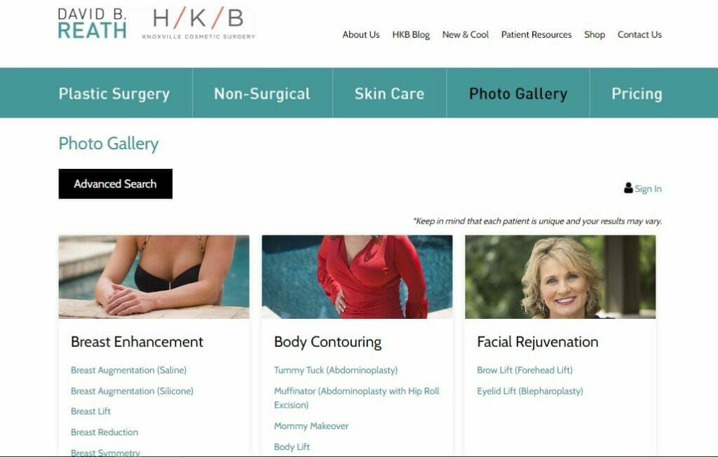
David B. Reath‘s color scheme is a cool mix of black, white, and blue-gray.
What they did right:
- The website contains a wealth of information about their treatments
- Provides a free, downloadable e-book about breast augmentation to capture leads
13. Cure Daily
The plastic surgery website design Cure Daily has is a simple yet elegant black and white.
What they did right:
- Simple yet elegant design
- Uses eye-catching images and videos of cosmetic procedures
- Convenient pop-up booking system
14. Douglas S. Steinbrech
The Douglas S. Steinbrech website uses a provocative image to get any site visitor’s attention.
What they did right:
- Eye-catching header image
- Nice gallery of before and after photos
15. David B. Reath
Dr. Reath’s is responsive and mobile-friendly. It invites potential patients to ask relevant questions about cosmetic procedures.
What they did right:
- Uses a mobile-friendly design
- Uses nice, easy-to-click graphics
- Effectively highlights surgical procedures and financing options

Are you dying to have your own jaw-dropping plastic surgery website?
We can make you the best cosmetic surgery website!
16. Florida Plastic Surgery Group
The Florida Plastic Surgery Group website heavily emphasizes its Florida location of bikini bods at the beach. It also includes excellent video introductions that introduce you to the four practitioners at this office.
What they did right:
- Excellent video introduces cosmetic surgery practitioners
- Effectively capitalizes on their business location
17. Houston Faces
The Houston Faces website uses sharp, soft pictures mixed with subtle colors. Features real people, including seniors making it relatable to potential patients.
What they did right:
- Website is relatable a broader audience
- Has a clear navigation bar
18. LidLift
The first thing you notice on the LidLift plastic surgery website is the huge image of a stunning model. Scrolling down the homepage reveals a wealth of useful information.

They also included a fantastic video clip from the doctor.
What they did right:
- Makes their specialty clear to site visitors
- Effectively introduces their medical service provider
19. Singapore Plastic Surgery Clinic
Singapore Plastic Surgery Clinic website design is straightforward. It has a simple black and white design and a simple navigation system.
The website copy emphasizes the advantages of plastic surgery and provides an overview of the services available.
What they did right:
- The website’s design is straightforward
- Uses a simple and uncomplicated navigation system
20. Bellevue Aesthetic
Bellevue Aesthetic is a German cosmetic surgery website. Its website is available in two languages: German by default and English.
The website uses warm earth tones to create a calm, relaxing atmosphere. It has an appointment booking feature. This allows site visitors to conveniently book an appointment online.
What they did right:
- Available in two languages
- Provides a convenient appointment booking feature
21. Shafer Clinic
The Shafer Clinic‘s website design uses a large front page. The longer you scroll, however, the more interesting information that appears. Everything loads so quickly that you want to keep reading.
What they did right:
- Uses a huge magazine-like front page
- Page is highly responsive
22. Eppley Plastic Surgery
Dr. Eppley is prominently displayed on his website, and for good reason. The website establishes right away that Dr. Eppley is a world-renowned expert with over 25 years of experience. This certainly increases your confidence in his abilities.
What they did right:
- Effectively shows off Dr. Eppley’s qualification
- Navigation bar is in plain sight
23. Kansas Plastic Surgery
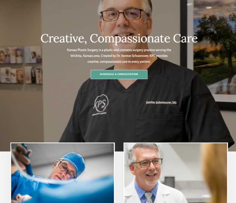
Kansas Plastic Surgery has a very simple navigation system and a cool blue and white aesthetic. It has a video header that plays when the website is opened.

This section contains information on surgical procedures, the consultation process, pricing, and other topics.
What they did right:
- Uses a dedicated to Frequently Asked Questions (FAQ)
- Higly informative content about procedures, process, and pricing
24. Union Square Facial Plastic Surgery
Union Square Facial Plastic Surgery has a sophisticated blend of white, indigo, and gold.
The website features high-quality images as well as animated transitions. It also includes testimonials from previous customers.
What they did right:
- Uses a sophisticated color scheme
- Uses high-quality images
25. Laseraway
Laseraway uses a minimalist web design. It has a simple yet fun color scheme of white, black, and pink. It is user-friendly due to its clean layout and simple navigation system.
It also has a system for requesting consultations online. This allows visitors to request a free consultation.
What they did right:
- Uses a simple and crisp design
- Offers free online consultations
26. Contours CLINIC
Contours CLINIC includes a consultation request system that appears automatically when you open it. The website’s design is contemporary, with a white, purple gradient, and blue color scheme.
There is also an appointment booking feature and a search bar on the website.
What they did right:
- Provided a convenient online booking for potential patients
- Effective lead capture strategy with pop-up
27. Gawley Plastic Surgery
Gawley Plastic Surgery has a convenient navigation bar with a screen reader that can read web content at three different speech rates (normal, fast, and slow).
Effectively introduces their doctors as well as their credentials and experience. Fortunately, none of this detracts from the site’s wealth of information. They also introduced the staff members.
What they did right:
- Navigation bar has multiple language options
- Builds trust and authority with homepage that includes a background video of the doctors
28. New York Group for Plastic Surgery
The New York Group for Plastic Surgery plastic surgery website uses a color palette of white, coral, and dark grey. This results to a warm aesthetic. Convenient and responsive navigation bar.

What they did right:
- Uses a simple warm aesthetic
- Provided a convenient and responsive navigation bar
29. Care Plastic Surgery
Care Plastic Surgery uses a color palette of white, dark grey, and purple.
What they did right:
- Visitors can view virtual images of how they will appear following the procedure
- Has a sophisticated appearance
- Provides a wealth of information available about scheduling a virtual consultatiom
30. Wave Plastic Surgery
Wave Plastic Surgery has a white and gold aesthetic that reflects its high-quality services.
The website includes high-quality visuals and animations that complement the still images and copy. Provides a convenient way for potential patients to ask questions with a live chat widget.
The navigation bar includes modes for people suffering from epilepsy, ADHD, and cognitive disability. It is also accessible to people who are blind or visually impaired.
What they did right:
- Uses high-quality visuals and animations
- Live Chat widget provides potential patients a convenient way to ask questions
31. Phi Surgery
Phi Surgery plastic surgery website exudes a very feminine vibe with the white and pink color scheme. The website makes it convenient for potential patients to book a consultation with an online booking widget.
What they did right:
- Available in English and French
- Provides convenience with an online booking widget
32. LINE Plastic Surgery Center
The website of LINE Plastic Surgery Center uses a white and purple color scheme. It has a Facebook Messenger chatbot. It also has a convenient online appointment booking system.

There are also Korean and Chinese versions of the website. Each has stunning visuals and features tailored to Korean and Chinese potential patients.
What they did right:
- Effectively links the website to social media platforms
- Provides convenience through an online booking system
- Provides a welcoming atmosphere for Korean and Chinese target market
33. VIP Plastic Surgery-Laser and Hormone Center
VIP Plastic Surgery-Laser and Hormone Center uses a cool dark grey and white color scheme with teal undertones. The website has drop-down menus on its’s navigation bar.
It is also placed next to its header, making it easier to navigate to different pages.
What they did right:
- Provides a convenient online booking system
- Convenient and easy to find navigation bar
Building the Best Plastic Surgery Website
Make a great first impression of your plastic surgery practice by owning one of the best plastic surgery websites. All the examples in this post is aimed to help you find the best practices to become the best plastic surgery website out there.
Show everyone that you are the top plastic surgeon with the most popular cosmetic surgery websites?
If you are having trouble building a website that meets your plastic surgery practice’s sales goals, our skills in website design are the best you’ll find. YoYoFuMedia will help with your digital marketing needs.


