Soko Glam has built a reputation for itself as a popular source to get your hands on all things Korean skincare. Korea is known for being a forefront in the skincare industry, popularizing an extensive skin care routine in order to get “glass skin” results. Soko Glam has helped bridge the gap that exists between the West and Korean skincare by being a reputable source to getting your hands on the most popular Korean skin care products on the market.
Founded in 2012, Charlotte Cho and her partner David Cho curated the sites to bring the most popular Korean skin care brands to the western market. Charlotte had a profound appreciation for Korea and its beauty products and trends, and finds it the opportunity of being able to share this love with a more diverse audience very rewarding. Years later, Soko Glam has now grown to be one of the largest distributors of Korean beauty and skincare in the US.
Behind its success lies within the brand’s branding strategies and how they were able to create a name for themselves through other products. We see the use of color used in a strategic way through their websites that engages customers, but this color branding idea is not revolutionary.
What is brand color psychology?

The idea of brand color psychology is not a new concept — brands have learned to effectively apply it in order to invoke certain emotions from an audience. Behind every branding strategy, there is an intentional use of color in order to convey a certain message. For example, the color red is often associated with feelings of danger or romance, but it also exhibits feelings of hunger. The color red is seen in the branding of various food chains such as Wendy’s, Arbys, and McDonald’s, to name a few.
Color is an integral part of a brand identity, and when used effectively, can lead to pleasing and memorable results. In the case of beauty brands, there has been an upwards trend of using certain pastel colors in branding in order to engage an audience. But why in particular pastel colors? What is it about pastels that make them more attractive in beauty packaging?
What are pastels?
Pastels are known as the pale colors in a color family. They are characterized by their high value, but low saturation of a pigment. Within the context of color psychology, they tend to exhibit soothing feelings. Pastels are normally very inviting colors — they are muted and never too distracting, which make them good contenders for use in packaging for beauty products. It is much more reassuring to reach for a bottle of face wash that is packaged in a baby pink box than it is to reach for something in a vibrant red.
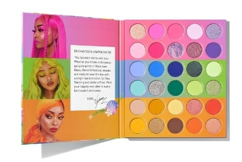
Pastels were heavily popularized in the 80s through men’s fashion, as well as through Miami Vice, in which a pastel color palette was heavily used. In more modern times, there began a resurgence of its popularity due to the “VSCO” girls trend and the new style concepts of “soft girl” and “pastel goth.” In the context of beauty brands, pastel colors can be seen in brands such as Drunk Elephant, Glossier, Kaja Beauty, etc.
Pastels in popular brands
Out of the three brands mentioned, Glossier has been one of the brands that have been on the rise due to its emphasis on more natural makeup looks and the approach to focus on skin first and makeup second. You will notice that many of their products focus on more natural finishes to the skin, a look that aligns more closely with the rising “soft/e-girl” aesthetic. Glossier’s approach to make-up seems to draw a heavy influence on Korean beauty brands, in which Korean beauty has always emphasized natural-looking beauty.
The packaging of Glossier products is very minimal and simplistic, which is very appealing to the millennial generation. Their packaging is usually always met with a spot color, which is often a pastel pink, or the color of what is inside the product (whether it’s a lip balm or cheek stain). When this is placed relative to popular Korean brands such as Etude House or Innisfree, it becomes quite evident that the use of pastel colors is particularly popular in Asian beauty.
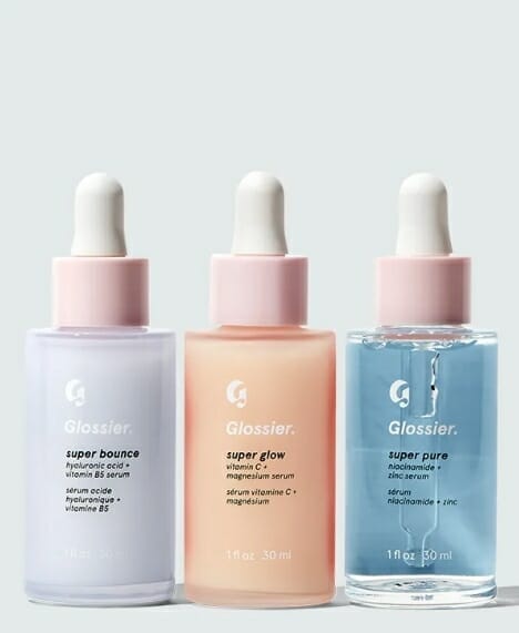
Source: glossier.com
Soko Glam and their website
Soko Glam’s homepage incorporates many effective design principles, such as the use of a grid and clean and clear typography. This simple aesthetic appeals to many millennials by making proper use of white space within the layout of the website. The pages never feel too overwhelmed with extraneous information and create a nice visual flow for the audience. The pastels are a nice overall touch in order to create a harmonious aesthetic on the page.
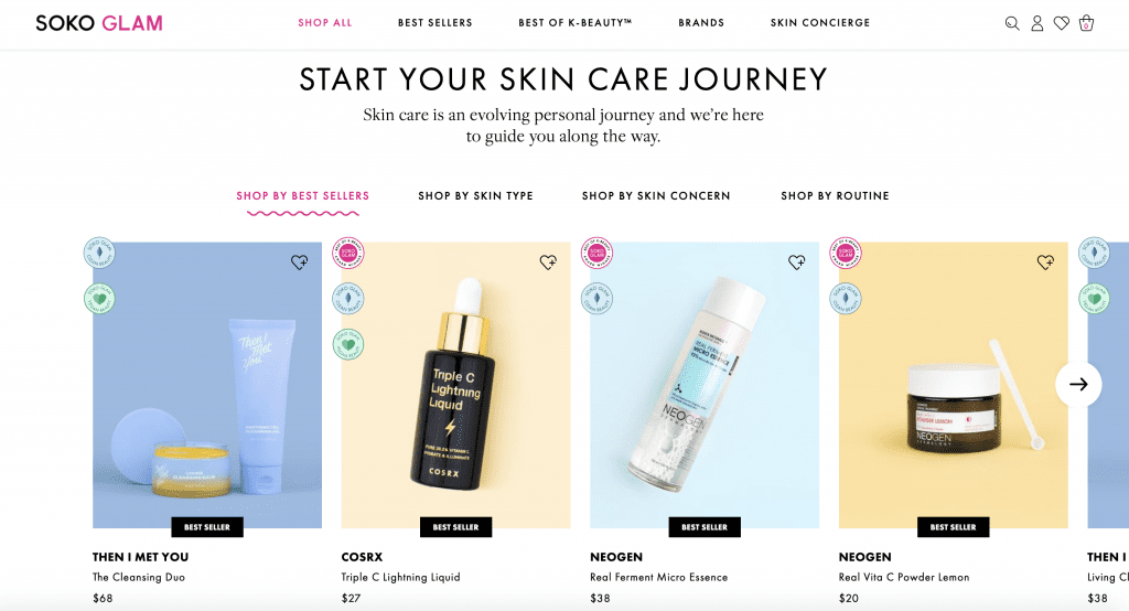
The user is able to navigate the website through various helpful links, making the user experience very open and unconstrained. They can decide to look at best-selling products that seem to work for a general population, or they can decide that they want to target a very specific skin concern and look for products that would help with that.
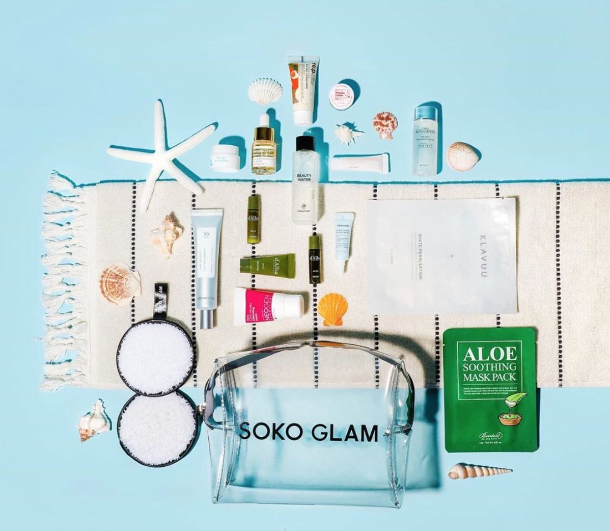
Although Soko Glam sells and markets other brands, the way in which they advertise the products has a distinct personality to them. All of their products are displayed with a pastel-colored background, creating a sense of cohesion throughout the website. This is the same despite whether or not the product is a direct collaboration with Charlotte Cho and another brand, or if it is another brand’s product entirely.
Soko Glam and The Klog
Although Soko Glam does not actually make products of its own, its credibility lies within the content that is seen in their own blog, The Klog. The Klog is what distinguishes Soko Glam from other Korean beauty distributors, as the blog is a site for people to share reviews on hundreds of different products. By including a skincare blog within the Soko Glam website, customers are able to enter a one-stop shop for all their skin care needs. Whenever a consumer needs to find information about a particular product, such as its effectiveness or whether or not it will work for their certain skin type, they can easily find such reviews on the Klog. After they are done doing their research and reading reviews from fellow skin care lovers, they can easily go back to Soko Glam to purchase their desired product. This interconnectedness between the sites is what sets Soko Glam apart from its competitors.

Learning to adapt to the extensive Korean skincare routine is no easy feat. There are many steps, as well as many layering of certain products in order to get the best out of one’s routine. Not only is The Klog a great space to read about reviews, but people who are experts at skincare and people who are just starting out can gather in the same space to learn more.
The Klog also follows a similar branding image to that of the Soko Glam. Even though you are on a completely different site, the colors and the format still seem familiar. Large blocks of pastel color take up the space in a strategic way that does not feel inundating, nor do the others ever clash with each other in a distracting way.
Western vs Eastern Use of Color in Beauty Branding
Source: morphe.com
The trend of using pastel colors in branding, however, seems to be largely prevalent in Asian beauty brands. Western makeup is often defined by having very sharp and defined features (which can be achieved through makeup). Thus, western brands tend to go for a stronger, bolder look, which seems to align with the sleek and sharpness of the beauty trends that are popular in the western sphere. Brands like Morphe, MAC, or Bobbi Brown all have very monochromatic branding strategies. Their packaging is a sleek black with little ornament, often to give off the appearance of a high-end product, but there is hardly any color being incorporated.
With western brands having such an emphasis and infatuation with sharp cheekbones and clean lines in makeup, the sleek packaging of these products seem to do a good job at representing these ideals. This form of branding, however, seems a little more intimidating due to the use of darker colors and is not very inviting, especially to those who are newer to make-up.
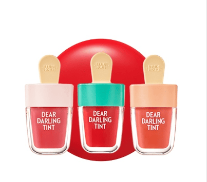
Source: etudehouse.com
Asian beauty on the other hand, emphasizes more on natural beauty and glowing beauty from within. This is why you will see that Asian beauty will put a higher emphasis on skin care, as skin is the most important feature in emphasized in makeup. Without healthy, dewy skin, there is not a strong foundation for the makeup.
In Asian beauty, you will see many brands that are more playful with their packaging and concepts as this can be seen in popular Korean brands such as Etude House, Holika Holika, and Aritaum. These brands express themselves through a more varied use of colors from pastels to brighter hues. Brands like Etude House have more playful concepts, such as heart shaped lipsticks or popsicle shaped lip tints, alluding to a more traditional definition of femininity.
Thus, there is no doubt as to why popular brands such as Glossier have adopted the use of pastels into their branding identity. Glossier seems to have strong influences from Korean beauty, as their products mainly focus on enhancing natural beauty rather than hiding it. Glossier is a brand for those who are fine with products that are not full coverage and will not give you that “snatched” look that is achieved through more traditional western brands. The use of pastel colors in their packaging is just another way in which Glossier has adopted Korean beauty trends to fit in the western market. When placed on shelves in a store, they are sure to stand out amongst the many other bottles and tubes contained in black packaging.
Image sources: morphe.com, etudehouse.com
Why does this strategy work?
Many beauty brands tend to resort to pink-ish colors because it is traditionally linked to femininity and girliness. Whether it is through the actual color of the product itself (i.e through pink lipsticks, blushes, eyeshadows, etc), or through the actual packaging, the color pink has always been a safe color for beauty brands. However, as society branches towards a direction where femininity is not defined by just one particular color, we can see how more recent brands have incorporated a more diverse color palette full of muted tones. These muted tones are more dynamic, yet soft because they are not too overpowering.
Pastels have been effective for quite some time now, despite its now rising prominence. As pastels are also an art medium, they have been used for centuries now, existing very subtly in the art and design world. When Pantone made a surprising announcement in 2016 about the color of the year being two colors of the year, one being a pastel pink called Rose Quartz and the other being a blue called Serenity, the popularity of pastels really became evident. And because Pantone chooses colors based on already existing trends, the spread of popularity in these colors and others in its family were inevitable.
Pastels are mainly effective due to its ability to withstand time. It can be considered as the anti-modernist colors of color. In beauty brands, when used effectively, can garner the attention of an audience that admires modern aesthetics and clean design. Pastels are not for everyone and work best when used in moderation, but it is a trend that has proven its relevance for years and perhaps many more years to come.


4 thoughts on “What You Can Learn from Soko Glam Color Branding Strategy”