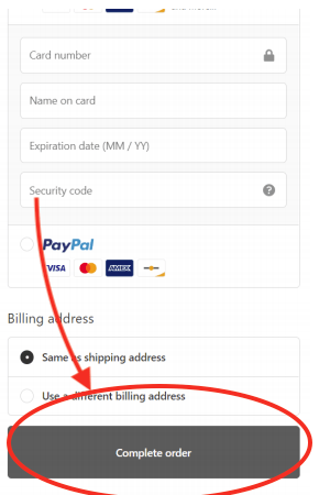
From looking at the checkout page, we believed that the “complete order” button being grey blended in with the Shopify site’s checkout’s theme. It made the button harder to find then it should be.
Our hypothesis was that changing the button color to gold would make it stand out from the theme and be eye-catching.
It’ll subconsciously push the user to want to click that button and move forward with the checkout process.

One important thing to note on button color tests:
I bet you’ve seen case studies that have declared that they a/b tested their button color Green vs Red –and Green outperformed red. And in the case study, they come to the conclusion that green is the color of “GO” and red is the color of “STOP” thus green performed better.
And I bet you’ve even seen case studies where the exact opposite happened. Red outperformed green. So they declared that “red” is the color of action thus it made people want to buy.
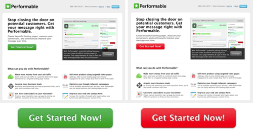
*cough* hubspot *cough*.
Neither is true.
It’s about contrast.
The color doesn’t matter.
In that case study red outperformed green because it contrasted with the rest of the of the theme which was green.
If you put a green button in a green theme, it’s not as effective because it blends in. Whereas a red button would stand out.
The button color being “red” didn’t matter, it’s was the contrast that made the difference.
Put a green button in a red theme and it’ll outperform a red button in a red theme.
Anyway, back to our test: we decided to test our hypothesis that the color gold would stand out from the rest of the theme. And that standing out would increase conversion rate.
Result:
Our hypothesis was supported by the results of the test!
At a 96% probability to beat the baseline (the control).
As you can see A/B test showed that the variant outperformed the original by 28% revenue (median).
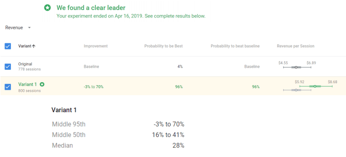
Here’s an article on why we use the median in our case study: long story short, it’s the most accurate and less exaggerated. Almost all case studies you see online use the bigger number, the 70% increase in revenue at the top of the Middle 95th. It makes their case studies look good, but is incredibly misleading.
And we hate it when people do that.
Warning (As Always): don’t just read this case study and go “oh I’m going to change all my button colors to gold” without a/b testing first.
This worked in the context of our client’s site and theme.
Just because changing it to gold increased their conversion rate doesn’t mean changing your button to gold will for your site.
For example, if you have more bright colors/pictures in your theme and gold blends in more than grey, it’ll likely to decrease your conversion rate.
If you make changes without proper procedures and data to back it up, you will ruin your stores conversion rate and destroy your revenue and profits –it’s easier to make conversions rate worse than it is to make it better.
Think of all the times your favorite site changed their design and you couldn’t figure out how to use it so you stopped using it as much.
There’s a reason Amazon changes their slight slowly through a/b tests and not all at once off of “intuition”.
If you don’t have the proper scientific methods in place, you won’t be able to judge how the changes you made have affected your store.
Therefore, don’t go out and blindly switch your buttons to gold without testing first.
This isn’t the caveman days. Don’t just implement, always a/b test first.


