57% of web traffic in the U.S. comes from mobile devices. And if we’re talking about global statistics, 90% of the internet population prefers using their mobile phones or tablets when going online. This is because most people find it more convenient, especially people who are always on the go.
So, if you have a chiropractor website that isn’t mobile-friendly, you might be losing a lot of potential patients to your chiro clinic! In this article, we’ll share with you some tips on how to create a mobile-friendly site for chiropractors that will surely help you get more traffic to your website!
Table of Contents
ToggleWhat does having a mobile-friendly website mean?

The term “Mobile-friendly” is used when your chiropractic website is highly responsive not just for desktop users but also for those who are using their mobile devices. It means that the overall content of your chiropractor website can be easily read and accessed by mobile users without hassle.
For example, if a person visits your chiropractic website through her phone, they don’t have to do additional actions such as zooming in or scrolling their screens from left to right just to read your content.
Interested in creating a mobile-friendly site for chiropractors?
Tips for creating a mobile-friendly site for chiropractors
If a person encounters a website where she needs to zoom in to read the text, there’s a high tendency for her to leave your website without taking action. To prevent that from happening, here are some tips that you can do to make your chiropractor website mobile-friendly:
1. Use simple web design
- Since mobile users have smaller screens compared to desktop users, you should avoid using templates that take too much of their screen space or the ones that are complicated to use.
- For example, instead of letting your main menu occupy too much space, try switching to a hamburger icon. This way your website will look neat and organized. Like in this example:

2. Compress images
- Page speed matters. Remember, website visitors will leave your site if 3 seconds have passed already and it hasn’t fully loaded yet. So, if you are using several images on your chiropractic website, you should consider the size that you are using because the bigger the image size, the longer it takes before your website completely load.
- To avoid that from happening, Compress Now and Tiny PNG are some of the image compressor tools that you can use for free.
3. Use third-party apps for your videos
-
- Just like photos, high-definition videos take too long before it fully loads. So, if you have videos on your chiropractor’s website, you can embed them on your site using third-party apps like Youtube and Dailymotion. This way, the weight consumption of your chiropractic videos is placed on those hosting programs, not on your site.
- Just make sure that if you are going to use Youtube, turn off “autoplay” so that it won’t play irrelevant videos after your chiropractor’s content has finished.
- Just like photos, high-definition videos take too long before it fully loads. So, if you have videos on your chiropractor’s website, you can embed them on your site using third-party apps like Youtube and Dailymotion. This way, the weight consumption of your chiropractic videos is placed on those hosting programs, not on your site.
4. Avoid very small font size
- Fonts also play a role in your page visitors’ user experience. Your page visitors should be able to read the text on your website in just one glance.
- The recommended font size is at least 16px. Don’t use sizes that are smaller than that because it’ll be harder for your page visitors to read the content of your chiropractor website.
5. Chop down long sentences
- Since mobile users have smaller screens compared to desktop users, you should keep your sentences short but precise. This way, it’ll be easier to catch their attention and keep them engaged in your chiropractor site.
6. Avoid using pop-ups for mobile users
- Pop-ups can be invasive sometimes. Especially for mobile users because it occupies the entire screen of mobile users which hinders them from reading content on your website.
- But if you don’t want to fully eliminate the pop-ups you have on your chiropractor website, you could still enable it but for desktop users only.
7. Make enough space for links
- If you are using hyperlinks on your chiropractor’s website, make sure that they aren’t overcrowded in one place, or else, your page visitors might unintentionally click the wrong link (which can be frustrating on their part).
- Also, don’t forget to test out the link that your page visitors will be redirected to because if it’ll redirect them to a page that’s not found or an error page, there’s a high probability that they won’t visit your chiropractor site again.
8. Use single columns
- Single columns are suitable for people who are using their mobile devices because all they have to do is scroll down to see more content about your chiropractic website. There’s no need to swipe left and right interchangeably just to read the entire text.
- As much as possible, use single columns in your chiropractor’s website design especially if a huge portion of your page visitors are mobile users. So, that it won’t interfere with their user experience.
9. Proper placement of Call-to-action buttons
- People should see a clear CTA button where they expect it to be. Common places where they are usually placed (for mobile users) are either at the center or bottom portion of your site. Avoid placing buttons where a user’s thumb is hard to reach. Like in this example:

-
- Note: Your CTA buttons should be big enough to be seen and stand out among the rest of the text of your website so that your chiropractor page visitors are more likely to notice it.
Want to learn more about how to market as a chiropractor? Read our guide today!
10. Regularly check your chiropractor’s site for issues
As a chiropractor, you should be the first to know whenever there are issues with your chiropractic website. To prevent certain issues from being overlooked, here are some of the best mobile-friendly checker tools that you can use for free:
1. Google Search Console
Google Search Console provides you with a mobile usability report whenever they detect problems in your chiropractic website (i.e. texts are too small to read, clickable elements are too close together, or content is wider than a mobile screen).
Not just that but it also gives you more data such as the number of clicks and impressions you get on certain devices, your website’s top pages, URLs with a good experience, and more!

Want your practice to appear more on the Google Search Engine? Use chiropractic Google Ads to get more patients viewing your page.
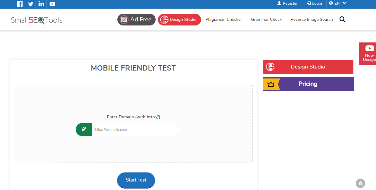
2. Small SEO Tools
Small SEO tools give you a score on how responsive your chiropractic website is to mobile users. From the score that will be given to you, you’ll be able to get an idea of the areas that need to be improved on your chiropractic website.

Here’s a sample report of a chiropractic website’s mobile-friendly test using Small SEO Tools:

3. Site Checker
Site Checker is another mobile-friendly checker that analyzes your chiropractor’s website and provides tips on how to improve your site’s performance.

Here’s a sample report of a chiropractic clinic’s website analyzed by Site Checker:

You can also improve the patient experience by optimizing your chiropractor page.
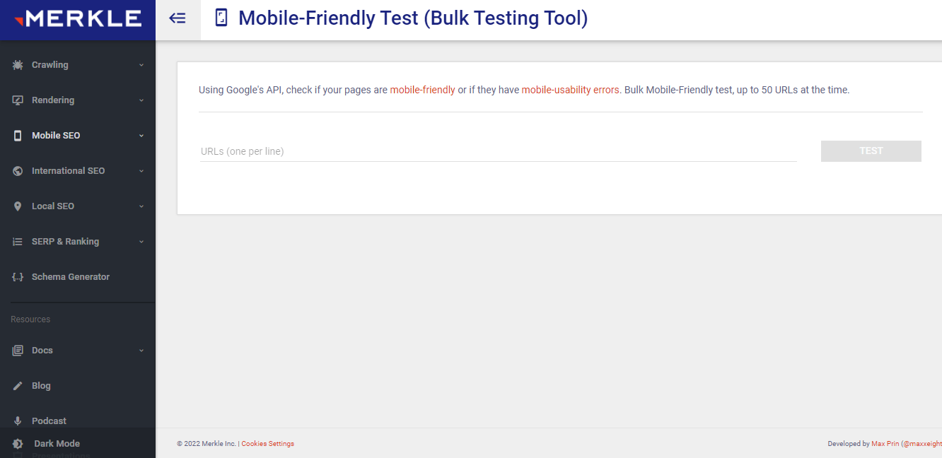
4. Technical SEO
Technical SEO is another mobile-friendly checker tool that checks your chiropractic website if there are mobile-usability errors. This tool can test up to 50 URLs at a time, so if you want to check your competitor websites’ mobile responsiveness, this tool is suitable for you.

Here’s a sample report of a chiropractic website’s mobile-friendly test using Technical SEO:

By providing a mobile-friendly site for your existing and potential chiropractic patients, your page visitors will want to stay longer on your website because it’s easy to use and all of the information that they’re looking for can be easily found which helps reduce the bounce rate in your chiropractor website.
If want to get more insights into your website’s performance, read our blog post on Google Analytics For Chiropractors to learn more.
Don’t have enough time to make your chiropractic site mobile-friendly?
Help!” ]
Key takeaway
Now that you have an idea of how important having a mobile-friendly site for chiropractors is, now’s the time you start making your chiropractor website compatible with mobile devices. Just follow all of the tips we’ve mentioned in this article, and you will see results in no time!


