
As technology becomes increasingly intertwined with so many aspects of our lives, there have been so many app options available to help us throughout our daily lives. From apps that keep track of our health and fitness, to apps that help us easily connect with others through means of social media, there are apps for almost everything. Thus, it has become more and more important for mobile app design to make lives easier, not harder.
Mobile App Design

eCommerce has become a realm that is gaining much popularity and traction, due to the ease of shopping online without the hassle of having to go outside to shop. With Amazon dominating the eCommerce scene, it has become evident that the power that eCommerce holds. For many people, they prefer shopping online over going into the actual store because it is more convenient, and with expedited shipping and free returns that many stores offer, it can seem more feasible to shop online.
We have talked about the importance of designing for mobile sites for eCommerce, but what about mobile app design? Designing for mobile is also an important aspect of technology, and with mobile design comes mobile app design. Mobile app designs must be user friendly and engaging in order to create a pleasant user experience, and in the case of eCommerce, a pleasant shopping experience.
Case Study 1: Ulta Beauty
Many eCommerce apps are created with a goal in mind to consolidate everything on their mobile website in a space in which all that information can be accessed within a single app. Although it may be good to have all of that information consolidated, the app must be easy to use and be engaging to the user.
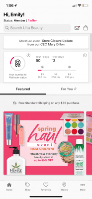
In the case of Ulta Beauty, I enjoyed being able to easily navigate through the app and its screens. As with many mobile apps for eCommerce, the navigation is at the bottom of the screen with several tabs: home, shop, favorites, stores, and a more tab that stores account information.
The homepage features their highlights, such as the deals that they are having that day, or new arrivals of products. On the homepage, users are also able to view the $3.50 coupon that Ulta always offers, which allows consumers to take $3.50 of their $15 purchase on most products.
Ulta also advertises their virtual lab, where people are able to try on products before they buy. This can be extremely beneficial and useful for people who are shopping online, especially in the current situation with Covid-19. The virtual lab enables users to try on foundations and other face makeup products to see if they like how a particular product looks on them before they commit to buying it.
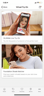
In addition to their virtual lab, they also have a foundation shade matcher in which people can use their phone camera and the app will match them in foundation shades for all foundations. The app analyzes skin tones and undertones in order to provide the user with their shade for any foundation that they choose. Matching foundations is one of the most difficult parts of buying foundations online, as it is difficult to envision how a shade would look on you if you do not have the options to try them on.
Both of these tools within the app really make the shopping process much easier by providing the user with guidance, similar to how a store associate in the store would help. These virtual services are a great addition to the app to further make the process of shopping from a phone or mobile device much easier.
In the shop tab, users are able to narrow down their search by brands, new arrivals, or categorically. This makes it easier for users to explore products, especially if they do not know what in particular that they are looking for. These features encourage users to look through products and potentially find more than what they are looking for, which may increase sales. Users can fall into a rabbit hole of just looking through more and more products, increasing their user engagement with the app.
The favorites option is one of my favorite features to include on a mobile shopping app. It makes it easy for users to sort products and look for them in a simple space. At the end of the shopping experience, people are able to look back on their favorited items before they make the decision to purchase them. This also makes it easy to refer back to what products they already have seen and liked, as well as go back to them if they need to compare them to any other products.
Another nice feature that the Ulta app has is the map feature. As this is a mobile app, people can be navigating and using the app at any location. Thus, it is nice to have a feature that can tell you where the nearest Ulta is based on your location settings if you have them enabled. The map further consolidates more information in an easy to use space, lessening the steps that a person may take to find the nearest Ulta, i.e. going to google and manually searching it themselves.
Overall, the app interface flows quite nicely and smoothly. It is very easy to navigate to a certain product and their product description. It provides a very seamless and easy customer experience, and takes into account many considerations when shopping online.
With the implementation of virtual labs and virtual help that mimics the help of sales associates, the app has successfully succeeded in providing an engaging experience for users.
The Ulta Beauty app not only makes searching for and buying a product easy, it also has many features that adds onto its overall experience. Instead of just focusing on the starting point of the user opening the app and the ending point of a customer making a purchase, they have really identified problems with online shopping for makeup and worked towards addressing those concerns.
Case Study 2: Kylie Cosmetics
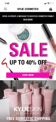
When using the Kylie Cosmetics app, I did not feel as if there was a distinction between the app and the mobile website. The interfaces were almost identical, and I did not feel as if the app consolidated all the website information in an easier and more user friendly way.

Similar to the mobile site, the navigation bar was a side menu that is not always visible unless you tap on it to expand it. This is unlike a lot of mobile eCommerce apps as there are typically menus placed on the bottom of the screen to grant the user easy access. By placing it on the bottom of the screen, users are able to quickly navigate to quick tabs, such as their favorites, account, or cart.
The homepage of the app previewed some of the highlights, like Ulta, and showcased their sale and their bestsellers and new arrivals. However, there were times where I felt like there was an information overload — there was just so much being advertised in a small space. There did not seem to be a sense of organization to this information, but just a bunch of products being advertised with not a clear sense of cohesiveness.
The navigation bar does a better job of segmenting information for products. All of the products are listed underneath the collections tab, in which users are able to view all the different products that Kylie Cosmetics has to offer. This made more sense to me than the overload of information presented on the homepage that can be seen as distracting. When distraction happens, users are more likely to passively pay attention to those messages and ignore it, rather than actively engaging and participating in the shopping experience.
As far as the interface goes, I felt like I was being redirected to so many pages to find information. From the collection, I was redirected to a certain category. From the category, I had to choose from subcategories within that category. After that, I was directed to several listings of products within that subcategory.
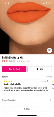
When I clicked on a product, I was not able to see all the information in one place. The product information was not even shown on the main page. If I wanted to read more about the product, I had to tap on the product description and a pull up menu was shown. This was also the same for the case of reviews. I felt like the user flow was beginning to become more complicated than it should have been.
I found myself spending too much time looking for specific information rather than really enjoying the shopping experience. I was looking at products passively and not really engaging with the content. Another thing that I found annoying was that if I was looking at a specific product, I could not immediately go back to search for another item or action in the navigation bar. I had to go all the way back through several pages in order to reach the navigation bar again rather than immediately transitioning to another area of my search.
Throughout the app, I did not see much that made the shopping experience easier. For the most part, it seemed to mimic the mobile site almost identically, and the app did not really add to any experience. There were no features like Ulta that made the shopping experience more personable, it really felt as if I was on my own shopping on the app. This can pose a problem for users who are new to makeup and unsure of where to begin. I do not think that the Kylie Cosmetics was effective in making the shopping experience any easier.
Furthermore, because the app and mobile site seemed so similar, I did not think there was a need to create the app where there is an already existing interface for a mobile shopping experience. The app does not really do a better job at consolidating the information, nor did it provide a smooth shopping experience that engages users and make them more inclined to purchase.
Information and the ease of usability throughout the app seemed really convoluted. There did not seem to be a very thoughtful user flow process planned for navigating the app. It was difficult to explore products, whereas the Ulta app really facilitated that process. I did not find myself going down the rabbit hole of Kylie Cosmetics products, rather, I felt like I just wanted to look for the specific products I want and leave the shopping experience.
Final Thoughts
Both of the apps that were mentioned and explained both revolved around beauty and making shopping for beauty products more accessible through a mobile app design. However, we can clearly see how the Ulta Beauty app outperformed that of the Kylie Cosmetics app.
Overall, the Ulta app provided a very user friendly interface and really helped to guide the shopper through the process of buying makeup without having to be in the physical vicinity of a store. The app truly made makeup shopping a much more pleasant experience, especially when it can be difficult to try on products when the user is not in a store. It can be hard to envision how a certain product might look without trying it on, but the Ulta app really provided a solution to that problem and bridged the gap.
Kylie Cosmetics is off to a decent start, but I think much can be done so that the app caters more towards the actual shopping experience, rather than aimlessly promoting products and depending on the will of the consumer for a purchase to be made. User engagement is essential in creating an effective app and is something that Kylie Cosmetics should consider on improving in order to facilitate a more user friendly shopping experience.
Through both these case studies, much can be revealed about how an eCommerce mobile app views the shopping experience. It is important for these apps to really keep the consumer in mind when designing the experience and the interface in order to maintain engagement, which in turn, can result in more sales.


