(Don’t know what an A/B test is? Read this short explanation first)
Here’s one of our A/B tests:
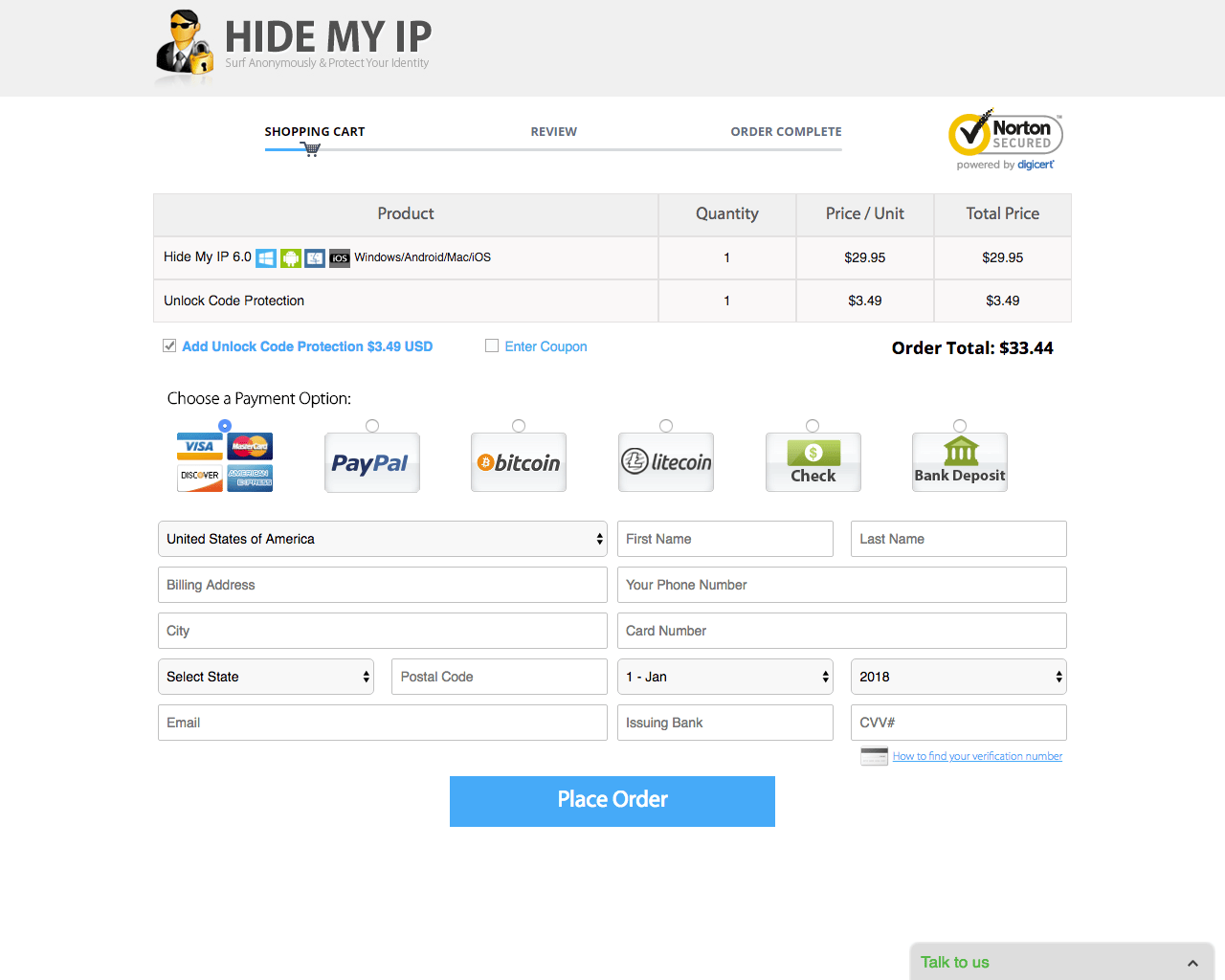
Here’s the Original Checkout page (Variant A):
- Header:

- Footer:

Variant Without Header and Footer (Variant B):
Variant B outperformed the Original in all areas:
-
- Increase 1.427X in Orders Completed
- Increase 1.475X in Transactions Made
- Increase 1.5X in Revenue
Here is what we did in our successful Variant B, we removed the footer, the link to homepage in the logo image and the call button up top.
This way the user is funneled all the way through the process and completing the purchase. Previously users would jump around and look at other stuff and then forget about buying.
How many times have you thought of something you need to do then immediately went to your computer to do it, but an hour later, find yourself looking at random websites and forgetting what you were going to do in the first place? Based on our user onboarding tools and analytics and user interviews, we were seeing a lot of users doing the same thing. They would click on a link in the middle of the checkout and not come back to finish the order. We were also seeing users read the footer texts, hesitate and not move forward. So we decided to remove all unnecessary links and information on the checkout page and see if that performed better.
Our hypothesis turned out to be correct and was effective beyond belief. Removing unnecessary links and information on the checkout page removed distraction and hesitancy. Without unnecessary links, potential customers were likely to stay on the checkout process after already deciding that they are going to buy.
Our order completion rate increased by 1.427 times and our transaction rate 1.475x times. As a result, our revenue increased by 1.5x.
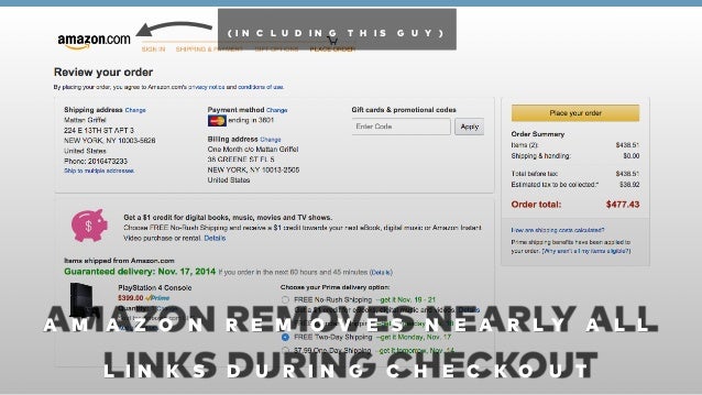
Amazon uses the same tactic in their checkout process too.
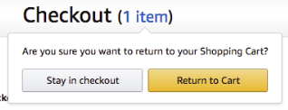
And for the links that Amazon absolutely must have, Amazon shows a small pop up that asks the users if they are sure they want to leave:
Overall, your UI (user interface) shouldn’t be complicated and clogged up. If it is, it’s time to clean it up. Some things may seem necessary but once you remove it, and test it out, you’ll realize how excessive it was in the first place. A clogged up UI bombards users with information that they themselves have to filter out.
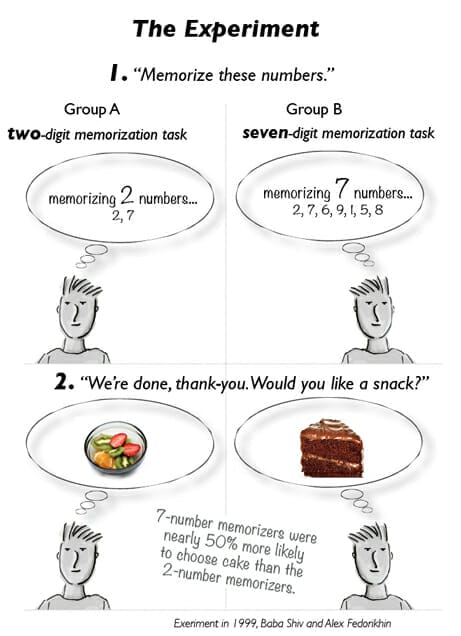
Decision fatigue is real.
“If your UX asks the user to make choices, for example, even if those choices are both clear and useful, the act of deciding is a cognitive drain. And not just while they’re deciding… even after we choose, an unconscious cognitive background thread is slowly consuming/leaking resources, “Was that the right choice?” ” —- Your App Makes Me Fat.
The buttons like the “add us on social media buttons” force users to consider those options and detract away from their main goal: buying the software.


