
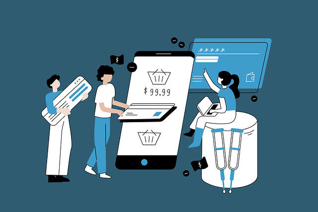
The mobile-first approach
In a day and age in which tech is slowly becoming more integrated into our daily lives, designing with a mobile-perspective becomes increasingly more important. Things can now be bought within a click of a button, with consumers often buying from mobile devices. Thus, it is important for developers to make sure that websites are responsive on a desktop level, to sizes as small as a phone.
It is not only important for websites to have a pleasing interface on mobile devices, but it also must be user friendly. No one likes a site that is hard to use. The design of the interface must convey important information about the website in a manner that is easy to understand and navigate.
Websites that do not prioritize mobile-first design or are not designed with a mobile-first approach will not have responsive design. This means that when you view the site on your phone, it will just show up as a shrunken site and the user must zoom in and swipe around to be able to find what they are looking for. This is an annoying and a tedious process which is not a good example of effective user interface design. If the interface is designed poorly, the experience that a user has with a site will mirror that.
Technology and the rise of mobile devices
The amount of information that is being produced increases with every day. There is a dense saturation of information, and the growth of such information is always growing. There are over 2.4 billion internet users worldwide, 300 billion emails being sent everyday, 500 million tweets sent out daily, and 100 million photos shared to Facebook each day. Due to these factors, there is a high degree of exposure to such media. The average person consumes around 15 hours of media everyday.

Thus, there has been a dependency on mobile devices in order to keep people connected and in the loop at all times. In order to reduce FOMO, or the fear of missing out, people are always connected to their phones or some sort of media in order to keep up with the inundating amounts of media messages and information that are being presented to us everyday.
As people become more attached to their mobile devices, technology has adapted to a mobile setting. Thus, it has become easier to do so many tasks on a phone. The mobile phone has consolidated so many features in one place, to text messaging, phone calls, web browsing, shopping, and so much more. With this in mind, there is a demand and a need to design with a mobile-first approach.
Mobile-first and eCommerce
When designing for an eCommerce website, there are many things that need to be taken into account. First, we must look at how easy it is to use and navigate the site to ensure a pleasurable experience for the consumer. If you take a look at most eCommerce sites, there are usually a few key components that are always featured on the navigation bar: your cart, your account, and the search bar.
 These features are things that consumers frequently go back to in order to complete their shopping experience. Consumers must be able to search for their desired items, so to do so, the search bar must be placed in plain view so that the user is always able to go back to it. For the most part, effective design will have the cart in the navigation bar too, and they are usually in the top right corner. This makes it easy for the user to be able to quickly navigate to the cart and see what items they intend to purchase.
With these key tools being readily available, it makes the experience of purchasing on a site that much easier, especially when consumers are looking for specific items and intend on purchasing such items. But what happens when a consumer enters a website without specific purchases in mind?
Another popular feature on many eCommerce websites revolves around a menu in which customers can browse through popular products, such as bestsellers, or new arrivals. On a mobile site, this is usually accessed through a type of side menu that pulls out. Because mobile screens are so small, space must be used wisely, which is when screen interactions take place as an important element of the user interface.
With some key points in mind, let’s take a look at an eCommerce website that is user friendly and easy to use and one that is not so much.
Soko Glam’s mobile website
In my opinion, Soko Glam does many things well. It has effective marketing tactics and a strong brand identity, despite it being a site to retail Korean products as opposed to being an actual skincare brand. To read more about their brand marketing strategies, you can read here. In addition, they have an effective website that addresses consumers’ needs and make it easy to make purchases on both desktop and mobile devices.
As you can see, the most important functions of the website are listed on top in their navigation bar. It really does not make sense to have these features placed anywhere else, as we typically look for these features at the top. There is a hierarchy to this page design, and the navigation bar is one of the most important elements to ensure that people are able to navigate the site (hence the name).
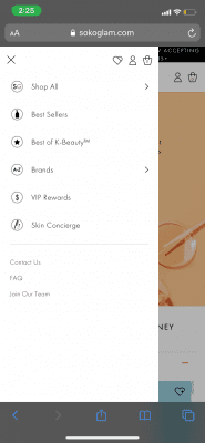
 In addition to this design, they also have a side menu, which is indicated at the upper left corner with the three lines. When you click on that feature, a menu appears. This screen interaction is a useful way to make use of the space that is given, without overwhelming the user with so much information. If this were to be used as a full menu that is constantly displayed on the navigation bar, it would be too distracting and overwhelming to use. Making efficient use of the space through screen interactions is key to providing an effective user experience.
The side navigation bar includes features that are not seen on the main navigation bar. This includes separating their products into different categories such as best sellers, brands, and the ability to view all the products that they have at once. This makes it easy for new users to explore the page and look at different skin products to see what piques their interest.
The side menu also still includes easy shortcuts to not only your account and your cart, but also to your likes as well. All of these elements make the shopping experience much easier, as you have a space to view not only items in your cart, but perhaps items that you are considering buying or adding to your wishlist for future references.

When you click on a product, this is the information that is shown. It highlights the products through several categories of information: details, ingredients, and how to use. All the information that consumers want to know about the product is consolidated into a single space on the page, and it is easy to toggle from one section to another.
One of the highlights of Soko Glam in general is the way that they are able to include their blog, The Klog, throughout the website. At the end of the product description, a link is included to read even more about the product on their blog. This is a seamless interaction between the two sites, as this drives more traffic to the blog. If a person is unsure about whether or not to purchase the product, they can go to the link and read more about it. If they find that what they read is enough to convince them to buy the product, they can easily navigate back to Soko Glam to purchase the product, potentially driving more sales. To read more about Soko Glam and how they have marketed The Klog, you can read more about it here.
Zara’s mobile website
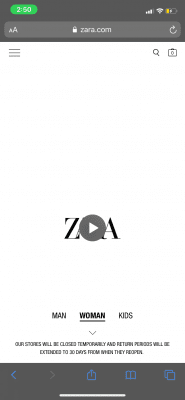
Zara has a very unique mobile website. It’s approach is something that I have never seen before. Although their website is quite clean and editorial looking, I think that its approach focuses more on aesthetics rather than usability. Recently, the homescreen has featured a video, which for some reason does not play on my phone (I am not sure whether it is a website issue or a problem with my own phone).
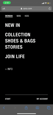
It took me a while to get used to the website and its flow. The way that it redirected users depending on what they clicked on was quite strange for me. There is a lot of swiping involved, and it took me a while to figure out how to navigate to a certain section. Once I finally navigated to where I wanted to go, looking at the products that they had was a different story.
Zara has a tendency to upload multiple photos of the same item. For some, there may be 3 photos of the same item that redirects to the exact same item page. I find this kind of redundant and a little distracting. Not only does one product use up so much space, there really is no need to repeat the same item when the images can instead be placed on the item page. This becomes especially confusing when consumers click on the two different links to the same item, thinking that they are different, when in reality, they are completely the same.
Also, when you are on the item page, instead of scrolling side to side horizontally to view images, the user scrolls vertically. However, I noticed that when I scroll vertically, sometimes I scroll to another item, as that action is triggered by scrolling horizontally. By horizontal scrolling, users are able to look at other similar items, but there is no indication of what those items are. So when you scroll to the left or right, you are presented with a completely different product without warning of what it is to decide whether or not you even want to swipe in that direction. I do this most of the time by mistake, which I found annoying.
Overall, although the look of Zara’s online website is very aesthetically pleasing. It uses a strong grid and uses very editorial photos that embody the nature of the brand and the style that they endorse. It seems to be a mix of high-fashion but for more everyday use. I do occasionally browse Zara from time to time, and time and time again I remember how frustrating it can be at times to navigate the site due to the nature of its design. Although I appreciate the website’s take on embodying the high fashion style of the brand, I do not believe that it is very user friendly in providing a quick and easy shopping experience.
Final thoughts
In the case of Zara, their interface is very trendy and editorial, but usability was inevitably sacrificed. Soko Glam, on the other hand, was able to stay within the brand and was able to provide an easy shopping process. Two very different websites produced two very different results, and the success of the ease of navigation was dependent on the interface design and how it determined user experiences.
In a climate where technology is being more and more integrated into daily life, it is important to always consider the importance and the impact of designing for a mobile platform. Many people have turned to their mobile devices as a hub to do a multitude of tasks, often within the palm of their hands and within a click of a button. eCommerce websites must acknowledge these trends in order to create a pleasure shopping experience for users through creating beautiful and useful interfaces.


1 thought on “Designing with a Mobile-First Approach: Soko Glam vs. Zara”